If you sit on a benefits committee, approve vendor contracts, set plan design, or sign off on employee benefit programs, you are a fiduciary under ERISA. That responsibility comes with real legal exposure, and the litigation environment surrounding it has grown substantially over the past decade. The Consolidated Appropriations Act of 2021 added new teeth to this exposure by requiring health insurance brokers and consultants to disclose all direct and indirect compensation they receive in connection with employer health plans. That disclosure requirement has become a direct underpinning of a new and expanding wave of ERISA lawsuits, as plaintiff firms use disclosed compensation data to allege that employers failed to monitor whether their brokers were acting in the plan’s interest or their own, including in voluntary benefit programs where broker commissions are now under direct scrutiny. Understanding that environment is not a reason for alarm. It is a strong reason to ensure your process is documented, your decisions are benchmarked, and your programs are structured in a way that reflects the care the law requires.
The Employee Retirement Income Security Act of 1974, known as ERISA, was enacted to protect employees from the mismanagement of benefits promised to them. It does that by imposing fiduciary duties on anyone who exercises discretionary authority over a benefit plan or its assets, from benefits committee members and HR leaders to the brokers and consultants who advise them.
This post explains who is at risk, what the key legal theories are, and where this is heading.
Defined contribution plans still drive the majority of ERISA class actions, representing 63% of the 155 cases filed in 2025, tracked by Encore Fiduciary in partnership with the Dorsey & Whitney law firm. But health plan cases are the fastest-growing category, accounting for 25% of all filings in 2025. That share reflects the direct impact of the CAA’s disclosure requirements and the growing sophistication of plaintiff firms in applying ERISA fiduciary standards to health plan administration. Annual excessive-fee and imprudent-investment filings remain elevated, with 2025 among the busiest years on record at 94 cases, and the trajectory since 2020 reflects a litigation environment that has become structurally elevated, not cyclical.
Who Bears Fiduciary Responsibility
ERISA fiduciary status is not limited to the HR department or the plan administrator on the plan document. Anyone who exercises discretionary authority over a benefit plan, controls plan assets, or provides investment advice for a fee can be a fiduciary under ERISA. In practice, that includes:
Benefits committee members who review and approve plan design
CFOs and finance leaders who approve vendor contracts and fee arrangements
CHROs who set the parameters of health and welfare plans
Brokers and consultants who exercise discretionary influence over plan decisions
Investment committee members who select and monitor 401(k) investment options
The standard that applies is the prudent expert standard under ERISA Section 404(a)(1)(B): decisions must reflect the care, skill, and diligence of a person familiar with such matters, acting in the sole interest of plan participants. Courts do not evaluate fiduciary duty by asking whether the outcome was good. They ask whether the process was sound. Process is the protection.
How This Litigation Actually Works
Most benefits decision makers are surprised to learn how these cases get started. Plaintiff law firms do not wait for disgruntled employees to call. They use publicly available Form 5500 annual filings, which ERISA plans must submit to the Department of Labor, to screen for plan characteristics that have historically generated successful claims. Once a target is identified, the firm recruits a plan participant to serve as the named plaintiff in a class action, frequently through outreach to current or former employees. That participant’s role is to provide legal standing, not to describe a personal grievance. The firm files the complaint, and the employer is now in litigation that can cost millions to defend regardless of the merits.
This explains a pattern that otherwise seems contradictory. Recordkeeping fees and investment fees for large 401(k) plans have declined steadily for more than a decade, yet fiduciary litigation has accelerated over that same period. Plaintiff firms have found that surviving the early stage of litigation generates settlement leverage, and their business model does not require the underlying fees to actually be excessive. In our internal data, over the past five years there have been more than 200 settlements of excessive fee and imprudent investment lawsuits totaling more than $1.3 billion. Plaintiff firms typically receive approximately one-third of those settlements. Individual plan participants, by contrast, have received an average of $55 to $70 each per settlement according to analysis from the Davis & Harman law firm.
Excessive Vendor Fees Drive the Surge
Excessive-fee allegations jumped 64% in a single year, from 45 cases in 2024 to 74 in 2025, outpacing every other claim category. Forfeiture allegations rose from 29 to 48. Imprudent investment claims grew from 48 to 53. Across all three categories, the trend is consistently upward. The right panel of the chart below shows what that volume translates to in settlement dollars: total reported settlements peaked at $352.8 million in 2023 and have remained elevated, with $151.9 million settled in 2025 alone. Watchful, deliberate fee benchmarking is the plan sponsor’s strongest defense against all three of these claim types, because each ultimately turns on whether the fiduciary made a documented, reasonable, and informed decision about what the plan was paying and to whom.
One category deserves particular attention for employers running wellness programs: tobacco surcharge claims. Plans that impose premium surcharges on tobacco users must offer a reasonable alternative standard that allows employees to earn or recoup the full reward, typically a tobacco cessation program. Nearly 50 tobacco surcharge lawsuits were filed in 2024 and 2025, with multiple settlements reaching close to $5 million each. Courts have ruled in favor of plaintiffs in the large majority of motions to dismiss decided so far. This is one of the highest-frequency, most correctable compliance risks in health plan design today.
The Main Legal Theories: A Brief Overview
In defined contribution plans, the dominant allegations are excessive recordkeeping or investment fees, imprudent investment selection, and forfeiture allocation disputes. Health plan litigation has grown significantly since the CAA’s fee disclosure requirements took effect, with the most active categories now being prescription drug cost claims, tobacco surcharge violations, ghost network failures, and, most recently, voluntary benefit broker compensation arrangements where undisclosed or unreasonable commissions are now being scrutinized directly under ERISA Section 406.
Cases That Illustrate Where the Exposure Lives
These cases show the range of conduct generating ERISA fiduciary liability claims across both retirement and health plans, and why the risk is expanding well beyond the traditional 401(k) space.
Kraft Heinz Co. v. Aetna Life Insurance Co. (filed June 2023). Kraft Heinz sued its TPA for breaching ERISA fiduciary duties in managing its self-funded health plan, alleging over $1.3 million in duplicate and improper claims paid, cross-plan offsetting using plan assets, and blocking Kraft Heinz from accessing its own claims data. The case established that employers bear fiduciary responsibility for monitoring their TPAs, not just their retirement plan recordkeepers.
Lewandowski v. Johnson & Johnson (filed February 2024). A J&J employee filed a class action alleging the company and its Benefits Committee failed to monitor its PBM, Express Scripts, resulting in the plan paying nearly 500% more for certain drugs than pharmacies paid to acquire them. J&J allegedly never conducted a competitive RFP for PBM services. The case established PBM oversight as an active fiduciary obligation for self-funded health plan sponsors.
Navarro v. Wells Fargo (filed July 2024). Similar PBM allegations added a prohibited transaction claim under Cunningham v. Cornell, alleging Wells Fargo paid over $25 million in administrative fees to Express Scripts that were unreasonable compared to fees paid by similarly sized plans. The parallel cases against J&J and Wells Fargo together define PBM benchmarking as a fiduciary requirement.
Hecht v. Cigna (filed 2024, settled October 2025 for approximately $6 million). Cigna was sued for maintaining a ghost network, listing out-of-network providers as in-network. A court ruled in February 2025 that repeated and systematic failures to maintain accurate provider directories were sufficient to allege a breach of ERISA’s duties of loyalty and prudence, extending fiduciary obligations into network administration for the first time.
Voluntary Benefit Class Actions (filed December 2025). Four class action lawsuits filed in December 2025 targeted voluntary benefit programs, naming both employers and their benefits consultants as defendants. The complaints alleged the consultants acted as fiduciaries and engaged in self-dealing through undisclosed commissions. All four complaints alleged the employers failed to comply with the DOL voluntary plan safe harbor, in part because they filed Form 5500s for the plans, directly citing the CAA’s compensation disclosure framework as the basis for the fiduciary theory.
Singh v. Capital One Financial Corporation (settled 2025 for nearly $10 million). Capital One settled a forfeiture allocation case for one of the largest forfeiture-specific settlements on record, even after the DOL filed an amicus brief siding with the defendant. The settlement demonstrates that even legally contested theories can generate significant financial exposure before appellate courts reach a final resolution.
What Well-Prepared Employers Are Doing Differently
The employers best positioned in this litigation environment treat fiduciary process as an ongoing discipline. The specific practices courts and regulators look for are consistent across plan types.
Document every significant benefits decision. The legal standard is evaluated based on process, not outcome. A documented record of how a decision was made, what alternatives were considered, and why the chosen approach was reasonable is the primary evidence that prudence was exercised.
Benchmark regularly against a real comparator group. The duty of prudence and the cost reasonableness standard both require that fiduciary decisions be defensible relative to what was available in the market. A benchmark built from employers matching your size, industry, and region is direct evidence your costs fall within a reasonable range.
Monitor your TPAs, PBMs, and carriers, not just your recordkeeper. The Kraft Heinz and J&J cases make clear that health plan fiduciary oversight extends to the vendors administering your plan. Conduct periodic RFPs, review service agreements, and confirm you have access to your own claims data.
Review broker and consultant compensation under the CAA. The compensation disclosure requirements of the CAA are now being used directly in litigation. Review what your brokers earn on every line of coverage, confirm those arrangements are reasonable and disclosed, and document that review.
Review your voluntary programs against the DOL safe harbor. Test each voluntary benefit program against all four conditions: no employer contribution, fully voluntary participation, limited employer administrative involvement, and no employer compensation beyond reasonable reimbursement.
Check your tobacco surcharge program. If your wellness program imposes a premium surcharge on tobacco users, confirm it offers a reasonable alternative standard employees can realistically use. Non-compliance has proven expensive across nearly every case that has reached a ruling.
How Mployer Insights+ Supports Your Fiduciary Process
One of the most direct steps a benefits decision maker can take to strengthen their fiduciary position is to run an independent, third-party benchmarking review of their plan on a regular basis. This is what Mployer Insights+ is built to produce.
Completing an Insights+ review generates documentation that speaks to three of the core ERISA fiduciary obligations. On the prudent expert standard under Section 404(a)(1)(B), the report demonstrates that an independent, structured benchmarking analysis was conducted across all plan components. On cost reasonableness under Section 404(a)(1)(A), the cohort comparison against employers matched by size, region, and industry creates a data-driven, documented basis for evaluating whether plan costs fall within a reasonable market range. On the duty to monitor under Section 404(a)(1), running the review annually establishes a consistent cadence of evaluation with a written output each cycle.
Because Mployer has no carrier relationship, broker relationship, or financial arrangement with the plan being evaluated, the report reflects an objective assessment free of commercial bias. That independence speaks directly to the implicit requirement in the prudent expert standard that fiduciary analysis be conducted free of conflicts of interest, and it distinguishes the Insights+ review from a benchmark produced by a broker from their own book of business.
None of this is a substitute for legal advice, and employers should work with qualified ERISA counsel to confirm all applicable obligations are identified and satisfied. But in a litigation environment where 155 fiduciary class action lawsuits were filed in a single year and the scope is actively expanding into health plans and voluntary benefits, a documented annual benchmark is one of the most practical and defensible steps a benefits team can take.
See how your benefits package compares to your custom cohort at MployerAdvisor.com.
Sources
Encore Fiduciary / Dorsey & Whitney LLP: ERISA Fiduciary Litigation in 2025. 155 class lawsuits filed in 2025. Justin Bove, Chief Revenue Officer, Encore Fiduciary.
Mployer Insights analysis of public ERISA class-action filings and settlements, 2016-2025.
Davis & Harman LLP: 2025 Underperformance and Excessive Fee Settlement Survey. Average individual participant recovery $55-$70.
Consolidated Appropriations Act of 2021 (CAA), Section 202, broker/consultant compensation disclosure requirements for group health plans.
Kraft Heinz Co. Employee Benefits Administration Bd. v. Aetna Life Ins. Co., No. 2:23-cv-00317 (E.D. Tex., filed June 30, 2023).
Lewandowski v. Johnson & Johnson, No. 3:24-cv-00671 (D.N.J., filed February 5, 2024).
Navarro v. Wells Fargo & Co., No. 0:24-cv-3043 (D. Minn., filed July 30, 2024).
Hecht v. Cigna, filed 2024; fiduciary duty claim survived motion to dismiss February 2025; settled approximately $6 million October 2025.
Singh v. Capital One Financial Corporation, PACER Docket 1:24-cv-08538; settled approximately $10 million 2025.
Cunningham v. Cornell University, 604 U.S. 693 (2025).
Hughes v. Northwestern University, 595 U.S. ___ (2022).
A Quiet Docket, a Loud Signal for Benefits Leaders
The Supreme Court closed its October 2025 Term on June 30, 2026, and for once the biggest story for employee benefits is what the justices didn’t take up. After several years of consequential ERISA rulings, this term was unusually light on benefits cases. ERISA was the only major regulatory area the Court touched at all this cycle.
For CHROs and CFOs, that quiet is deceptive. The decided cases were narrow, but the case the Court agreed to hear for next term, combined with a fast-moving wave of litigation in the lower courts, means the exposure landscape is shifting under your feet even in a slow year. Here is what actually happened, and what belongs on your calendar.
A quick scheduling note. The Court runs on a fixed rhythm, opening the first Monday in October and running through late June. This term began October 6, 2025 and wrapped June 30, 2026. The next term, October Term 2026, begins October 5, 2026. That is when the case worth watching most closely will be argued.
The One Decided Case: M&K Employee Solutions
The term’s marquee ERISA decision was M&K Employee Solutions, LLC v. Trustees of the IAM National Pension Fund, decided unanimously on May 21, 2026, in an opinion by Justice Jackson.
The case concerned multiemployer pension plan withdrawal liability, the “exit tax” an employer owes when it stops contributing to an underfunded union pension plan. The narrow legal question: must the plan’s actuary lock in the actuarial assumptions, most importantly the interest and discount rate, as of the measurement date, or can those assumptions be set later? The Court held that assumptions do not have to be fixed on the measurement date. The measurement date fixes the facts about the plan, its assets, its participant data, but the actuary may select assumptions afterward, so long as they rest on information available as of that date.
Why It Matters, and to Whom
If your organization participates in a multiemployer plan, this decision removes a timing-based defense to a withdrawal liability assessment. The stakes are not theoretical. In the underlying dispute, a single change in the discount rate swung the fund’s unfunded liability from roughly $500 million to $3 billion. Employers can still challenge an assumption as unreasonable on the merits, but they can no longer argue it is invalid simply because it was adopted after the measurement date.
For CFOs with any multiemployer exposure, the practical takeaway is straightforward: keep current withdrawal-liability estimates in hand and treat assumption volatility as a live balance-sheet risk, not a historical footnote.
For the majority of employers, those sponsoring 401(k) or other single-employer defined contribution plans, M&K is informative but not directly actionable. Which is exactly why the next case deserves your attention.
The Case to Watch: Anderson v. Intel
In January 2026, the Court granted review in Anderson v. Intel Corp. Investment Policy Committee. This is the decision benefits leaders should be tracking closely. It has not yet been argued. It sits on the October 2026 calendar, with a ruling expected sometime in 2027.
The question is deceptively technical but enormously consequential: when a 401(k) participant sues plan fiduciaries for imprudently selecting or retaining an underperforming investment, must the complaint identify a “meaningful benchmark,” an appropriate comparator investment, to survive a motion to dismiss?
That pleading standard is the gate through which nearly every fiduciary-breach class action must pass. Set it high, and many suits end early, before discovery costs accumulate. Set it low, and far more cases proceed into expensive, prolonged litigation. However the Court rules, it will reset the cost-benefit calculus of fiduciary litigation for every plan sponsor in the country.
The action item here is concrete: put Anderson v. Intel on your 2027 watch list now, and revisit your investment-monitoring documentation in anticipation. Whatever standard the Court ultimately adopts, employers with a thin or informal fiduciary process will be the most exposed.
The Real Action Is Below the Supreme Court
If you read only the SCOTUS headlines, you would miss the trend most relevant to your benefits program today. Two lines of litigation are accelerating in the lower courts, and both are worth understanding now, well before either reaches the Supreme Court, if either ever does.
Voluntary and Ancillary Benefits Litigation
Building on the Court’s 2025 decision in Cunningham v. Cornell, last term’s ruling that lowered the bar for pleading an ERISA prohibited-transaction claim, plaintiffs’ firms have begun filing class actions over voluntary benefit programs such as accident, critical illness, and hospital indemnity coverage.
The theory: that employers failed to ensure premiums were reasonable, and that the brokers and consultants who placed those products acted as plan fiduciaries and engaged in self-dealing through undisclosed commissions. Notably, these suits name not just employers but their advisors directly.
The first line of defense is the Department of Labor’s voluntary-plan safe harbor. If your voluntary offerings do not satisfy all four of its requirements, ERISA fiduciary duties may attach to programs you never treated as fiduciary plans. That means the governance, documentation, and disclosure standards you apply to your 401(k) may now be relevant to your accident and critical illness offerings as well.
Forfeiture Litigation
A growing set of cases is challenging whether plan sponsors may use forfeited employer contributions, the unvested employer match dollars left behind when an employee departs before vesting, to offset future company contributions, rather than using those dollars to defray plan administrative expenses.
The Supreme Court has not taken these cases up, but the circuits are actively sorting through conflicting outcomes, and the resolution will shape a routine plan-design choice that most sponsors make without a second thought. If your plan document allows forfeitures to offset future employer contributions, a common and previously uncontroversial provision, it is worth understanding where the circuit split currently stands and how exposed your specific plan language is.
On the Health Side: A Notable Non-Decision
In January 2026, the Court declined to wade in. It denied review in Guardian Flight v. Health Care Service Corp., leaving intact a lower court ruling that there is no private right of action to enforce arbitration awards under the No Surprises Act’s dispute-resolution process. It’s a quiet development, but a meaningful data point for any employer managing surprise-billing and network-adequacy issues. The enforcement mechanism for No Surprises Act arbitration outcomes remains narrower than some plan sponsors may have assumed.
What to Do Before October
A light term is a planning window, not a reprieve. Three concrete moves worth making before the Court reconvenes:
Document your fiduciary process for both retirement and welfare plans. Courts increasingly judge prudence by process, not by hindsight outcomes. Regular committee meetings, engagement of outside expertise, and documented ongoing monitoring are what hold up under scrutiny, for your 401(k) and increasingly for your health and ancillary plans as well.
Inventory your voluntary and ancillary programs against the DOL safe harbor. Scrutinize the commissions your brokers and consultants earn on accident, critical illness, hospital indemnity, and similar products. Confirm all four safe harbor requirements are met, and ask directly whether your advisors are being compensated in a way that could be characterized as self-dealing.
Calendar Anderson v. Intel for the 2026 to 2027 term. Pressure-test your investment-monitoring file against a “meaningful benchmark” standard now, while you have time to strengthen it before a ruling potentially resets the litigation landscape.
The Justices Return October 5. The Quiet Won’t Last.
This term’s light docket should not be mistaken for reduced risk. The lower courts are actively developing theories around voluntary benefits, forfeitures, and fiduciary process that will shape benefits litigation for years regardless of whether the Supreme Court ever weighs in directly. And the one case already on next term’s calendar, Anderson v. Intel, has the potential to reset how every fiduciary-breach claim in the country gets pleaded and litigated.
Benefits compliance is not a once-a-year exercise triggered by a Supreme Court ruling. It is an ongoing discipline of documentation, benchmarking, and process, and the employers best positioned heading into next term are the ones treating it that way now.
Mployer’s benefits rating evaluates plan design and employer investment across Medical, Ancillary, Leave, and Retirement, giving CHROs and CFOs a documented, benchmarked view of how their plans compare to a custom cohort. That is precisely the kind of process discipline courts are increasingly looking for.
This is also where Mployer Insights+ does double duty. Running an Insights+ review produces the kind of independent, third-party documentation that speaks directly to ERISA’s prudent expert standard under Section 404(a)(1)(B). The report benchmarks your plan against a custom cohort matched by size, region, and industry, which gives you a data-driven basis for evaluating whether your costs and plan design fall within a reasonable market range under the cost reasonableness standard in Section 404(a)(1)(A).
It also addresses the duty to monitor under Section 404(a)(1), which is an ongoing obligation, not a one-time exercise at plan inception. An annual Insights+ re-rating establishes exactly the kind of recurring, documented review cadence that obligation calls for, with a written output each cycle that shows the analysis was conducted. Because the report is produced by an independent third party with no carrier or broker relationship to the plan being evaluated, it also speaks to the independence of assessment that the prudent expert standard implies.
None of this is a substitute for legal advice, and plan sponsors should work with qualified ERISA counsel to confirm all applicable obligations are identified and satisfied. But for CHROs and CFOs looking to strengthen their fiduciary process ahead of a term where the lower courts are actively raising the bar on documentation, an annual Insights+ review is a concrete, repeatable way to build that record.
See how your benefits package compares to your custom cohort at MployerAdvisor.com.
Sources
M&K Employee Solutions, LLC v. Trustees of the IAM National Pension Fund, decided May 21, 2026 (unanimous, opinion by Justice Jackson).
Anderson v. Intel Corp. Investment Policy Committee, certiorari granted January 2026; argument calendared for October Term 2026.
Cunningham v. Cornell University, decided 2025 (prior term).
Guardian Flight v. Health Care Service Corp., certiorari denied January 2026.
American Bar Association, October 2025 Term preview.
July brings major updates across Insights+, Catalyst, and Vista, focused on helping our partners work faster with more automation, deeper intelligence, and expanded AI capabilities, from instant benchmarking reports and smarter prospecting to more flexible reporting. Explore the updates below.
Insights+
Automated Report Generation — Insights+ reports now generate automatically the moment a request is submitted.
Redesigned Report View — The report now renders natively in the browser: cleaner, more readable, and a closer match to the final output.
Real-Time Edits — You can instantly edit and generate reports in real-time. No more wait periods or help needed to edit and generate a new report.
Strategic Recommendations in Mployer AI — Generate consultative, mode-specific recommendations directly in the report's AI panel across six modes — General, Cost Strategy, Plan Design, Coverage Gaps, Funding Strategy, and Underwriter Notes — then refine with follow-ups before sharing with a client.
Add Medical Plans on Upload Documents Flow — The "Do you have another medical plan?" question is now available on the Upload Documents flow, matching the flexibility already in Manual Entry.
Catalyst
AI-Powered PDF Export — A dynamic PDF export is now available from each company profile page. Choose between an Executive Summary or Full Report format, with content automatically tailored to the employer's available data, surfacing the most relevant sections, charts, and insights for each company.
Commercial P&C Data on Company Snapshot — The Company Snapshot now includes Commercial P&C Broker and Carrier Display Cards, giving you a consolidated view of an employer's commercial relationships without leaving the snapshot.
Commercial Lines Insights for Licensed Users — Users with a commercial license now see a Commercial Lines Insights section on the Opportunity & Signals tab, surfacing filing information from Commercial P&C data alongside benefits context.
Advanced Salesforce Entity Matching — Send-to-Salesforce now supports more precise account linking through advanced entity matching. A token-sharing fix also means one admin's Salesforce connection now covers the whole account.
Retirement Plan Quality Queries — The AI assistant can now answer questions about retirement plan quality, advisor relationships, and compliance status, extending natural language search into the retirement vertical.
Broker Classifier Filters — Filter brokers by scope (national vs. regional), retirement advisor status, and commercial lines activity, making it easier to ask targeted questions about broker specialization and positioning.
Broker Column on Commercial P&C Results — The Commercial P&C results page now shows a Broker column, so commercial broker relationships are visible directly from the search grid.
Vista
Simpler, More Flexible Report Generation — Upload a client's benefits and carrier documents, now several at once, and Vista builds a structured, broker-branded financial report from what's provided, without requiring every detail upfront. The output adapts to the documents you have, so you can generate a report for any group.
The Mployer Assistant, Inside Every Report — Every report now includes an AI assistant panel where you can ask questions about a client's numbers and get instant, report-grounded answers and talking points, pulled directly from the report.
A Redesigned Workspace — Vista is now built around a cleaner three-panel layout: quick actions on the left, your reports and report history in the center, and at-a-glance stats with search and filtering.
Vision Benefits: The Most Widely Offered Ancillary Benefit Employers Get the Least Credit For
Vision is the most commonly offered ancillary benefit in employer-sponsored plans. In fact 89% of employers offer it nationally, higher than dental, higher than life insurance, and higher than any voluntary benefit. And yet vision is also one of the most underfunded benefits in the market. The average employer contributes $3 per month toward a single employee’s vision premium. For a family, the average is $6.
That disconnect: near-universal offer rate, near-zero employer contribution, is the central story in vision benefits today. Employees enroll in vision at a 74% rate when it’s offered, making it a high-utilization benefit. But the financial signal most employers are sending through their contribution level is that vision is an afterthought: available, but not invested in. This piece covers the national benchmarks on offer rates, plan structure, contributions, coverage design, and the carrier market so employers can see exactly where their vision program stands.
Offer Rates and Plan Structure
Vision is offered by 89% of employers nationally the highest offer rate of any ancillary benefit. Among those who offer it, 74% of eligible employees enroll. That utilization rate is significant: nearly three out of four employees who are given access to vision coverage use it, which means the benefit is genuinely visible to your workforce. Employees notice when they use a benefit and when their coverage is adequate or not.
On plan structure, vision is even simpler than dental. A strong majority of employers offer a single vision plan 95% nationally. Two-plan structures are rare, and three or more plans are essentially nonexistent. Vision plan design is standardized enough that a single well-designed plan serves most workforce demographics without requiring the complexity of a buy-up option. The decision is less about how many plans to offer and more about whether the single plan you offer is adequately structured.
Employer Contribution: A Market-Wide Gap
Vision employer contributions are low across the board, and that’s not unique to any particular employer it’s a market-wide pattern. The national breakdown:
17% of employers pay 100% of the vision premium (full contribution)
42% of employers pay a portion of the premium (partial contribution)
41% of employers pay nothing toward the vision premium (no contribution)
The 41% contributing nothing stands out it’s materially higher than the comparable figure for dental (26%). Nearly half of all employers offering vision are passing the entire cost to employees. Among those who do contribute, the averages are modest: $3 per month for single coverage and $6 per month for family coverage, representing 50% of the single premium and 36% of the family premium.
The total vision premium is low enough that the contribution gap may seem inconsequential in isolation: $7 per month for single coverage, $21 per month for family. But the contribution pattern sends a signal that employees read into the broader benefits package. An employer covering 50% of a $7 single premium a $3.50 monthly contribution is technically contributing, but the gesture is so small it barely registers. Employers who cover vision premiums in full, or contribute at a meaningful level, stand out against a market where most employers are doing the minimum.
Plan Design: What Vision Coverage Actually Covers
Vision benefits are structured around a set of specific coverage elements: the annual eye exam, corrective lenses (glasses or contacts), and frames. Understanding how each element is designed and how frequently coverage refreshes is where meaningful plan differences emerge.
Copayments
Vision plans typically use copayments rather than coinsurance at the point of service. The national benchmarks:
Eye exam copay: $10 (national average)
Materials copay (frames and lenses): $25 (national average)
A $10 exam copay and $25 materials copay are well-established market standards. Employers above these benchmarks charging $25 for an exam or $50 for materials are meaningfully above the market norm on employee cost-sharing for a benefit that costs very little to provide generously.
Lens and Contacts Reimbursement
For corrective lenses and contact lenses, plans reimburse up to a maximum allowance. The national benchmarks by percentile:
25th percentile: $130 maximum reimbursement
50th percentile (median): $150 maximum reimbursement
75th percentile: $150 maximum reimbursement
The tight clustering at the 50th and 75th percentiles both at $150 reflects how standardized vision reimbursement levels have become. The median and the 75th percentile are the same number, which means the majority of competitive vision plans land at or near $150 for lens reimbursement. An employer with a $100 allowance is visibly below market; an employer at $150 is squarely competitive.
Contacts Coverage
Contact lens coverage comes in two structures, and the difference matters for employees who wear contacts exclusively:
In lieu of frames: $80 average maximum reimbursement applies when the employee chooses contacts instead of glasses
In addition to frames: $18 average maximum reimbursement applies when the employee wants both
The in-lieu-of-frames structure is the more important benchmark for contact lens wearers. An $80 allowance is the national average, but contact lens costs can easily exceed that a year’s supply of daily disposable contacts often runs $400–$800 before any reimbursement. Employers evaluating their vision plan should check both the contacts allowance and whether the plan requires contacts to be used in lieu of frames or allows both.
Coverage Frequencies: When Benefits Refresh
Vision plans specify how frequently each benefit type refreshes how often employees can get a new exam, new lenses, and new frames under the plan. This is one of the most variable design elements across vision plans, and one employees frequently compare:
Eye exams: 96% of plans refresh annually (12 months); 1% refresh every 24 months
The frames frequency is the most differentiated element. A majority of employers refresh frame benefits every 24 months meaning employees can get new frames every other year. The 41% who refresh frames annually are offering a more generous benefit in a category employees notice, since frames are both a functional and aesthetic item that employees actively choose. Annual frame refresh is a low-cost way to differentiate a vision plan from the majority of the market.
How Larger Employers Approach Vision Funding
Like dental, vision benefits are fully insured for the vast majority of employers the employer pays a fixed monthly premium, the carrier assumes the claims risk, and the administrative relationship is simple. This is appropriate for most organizations, particularly those without the scale to make self-insured vision economically meaningful.
For larger employers, self-insured vision follows a similar logic to self-insured dental: vision claims are highly predictable, low in severity, and consistent year over year. At sufficient scale, the carrier’s built-in risk margin becomes a visible cost that can be recaptured through direct claims funding. Self-insured vision adoption follows the same employer-size curve as dental low among small employers and growing significantly as covered-life counts increase, with the most meaningful adoption among employers with 250 or more covered lives.
As with dental, the most common path to self-insured vision at large employers is through the medical plan. When a large employer moves to an ASO arrangement for medical with a major carrier, vision is frequently bundled into the same structure administered by the same carrier, using the same TPA infrastructure, with the employer funding claims directly. The major medical carriers UnitedHealthcare, Aetna, Cigna, and the BCBS plans all offer vision as part of bundled ASO arrangements for large employer groups. This explains why major medical and group insurance carriers appear alongside dedicated vision carriers in the market share data: the two are often linked at the administrative level for large accounts.
The Carrier Market: Who Administers Vision Benefits
The vision carrier market divides into two segments: dedicated vision carriers that specialize in vision benefits, and group insurance and medical carriers that offer vision as part of a broader benefits portfolio.
Vision Service Plan (VSP) is the largest dedicated vision carrier in the country by both employer count and participant count. VSP operates as a not-for-profit and has built one of the largest provider networks in the vision market, which is a meaningful advantage for employers with geographically dispersed workforces. EyeMed, owned by Luxottica (the parent company of LensCrafters, Pearle Vision, and Sunglass Hut), offers broad retail network access as a differentiator particularly for employees who prefer the convenience of in-store vision care. Both VSP and EyeMed are purpose-built for vision and offer strong plan design flexibility.
Guardian Life is a major group insurance carrier with a strong vision product alongside its dental, life, and disability offerings. Guardian’s presence in vision reflects its model of offering bundled ancillary products to employers who want to consolidate their ancillary carrier relationships.
The participant-count view of the carrier market shifts noticeably from the employer-count view. Fidelity Security Life and Sun Life appear prominently when measured by participants but are smaller by employer count a pattern similar to what we see in dental, reflecting their disproportionate presence at large employer accounts. Carriers like Sun Life often enter the vision market through bundled ancillary arrangements with large employers who are already Sun Life customers for stop-loss or group life, giving them access to high-headcount accounts without broad employer-count market share.
For employers evaluating their vision carrier, the key considerations are network access (VSP and EyeMed have the broadest provider networks nationally), retail network options (EyeMed’s retail presence is a genuine differentiator for employees who prefer in-store care), and whether bundling vision with dental or medical creates administrative efficiencies. As with dental, employers who are not bundling through a medical ASO arrangement have full flexibility to select the best-fit vision carrier independently.
What Employers Should Be Asking About Their Vision Plan
Vision is a low-cost benefit relative to medical, which means the gaps between a below-market plan and a competitive one are correctable at modest expense. The key questions:
Employer contribution: Are you in the 41% contributing nothing toward the vision premium? The total premium is $7 for single coverage covering it entirely costs less than a lunch per employee per month. If you’re contributing nothing, the cost to move to full contribution is minimal and the signal it sends is meaningful.
Frames frequency: Do you refresh frames annually or every two years? The majority of the market is at 24 months, which means annual frame refresh is a genuine differentiator at low cost.
Lens and contacts reimbursement: Are you at or above the $150 median for lens reimbursement? Is your contacts-in-lieu allowance at or above the $80 national average?
Exam and materials copays: Are your copays at or below the $10/$25 national benchmarks? Above-market copays on a low-cost benefit are a visible friction point employees notice at every appointment.
Carrier and network: Does your current carrier’s network cover the geographies where your employees actually live and work? Network gaps in vision are one of the most common employee complaints about vision benefits.
See How Your Vision Plan Compares to Employers Like You
Most employers don’t know whether their vision plan is above or below market because they’ve never seen it benchmarked against employers who actually look like them. A national average tells you very little. What matters is how your vision contribution, your coverage design, and your carrier compare against other employers in your industry, your region, and your size band.
Mployer rates your vision plan as part of the Ancillary pillar score evaluated against a custom cohort matched to your specific industry, region, and employer size. Whether you’re a 75-person technology company in the Southeast or a 500-person manufacturing employer in the Midwest, the benchmark that matters is the one built from employers who are actually competing with you for the same people.
See how your vision plan — and your full benefits package — compares to your custom cohort at MployerAdvisor.com.
Sources
Mployer 2025 and 2026 Employee Benefit Plan Design Study, covering 50,000+ employer plans. All Size Average, All Region Average, All Industries.
Carrier market share data sourced from Catalyst, a leading analytics platform for carrier market share in the benefits industry. Data reflects fully insured vision plans; market share patterns are broadly representative of self-insured vision plans as well.
Dental benefits are not your largest cost center. For most employers, dental represents a fraction of what medical costs per covered employee annually. But dental is one of the highest visibility benefits in your package: employees use it, notice it, and talk about it. When it’s good, it builds goodwill. When it’s inadequate (low maximums, no orthodontia, zero employer contribution) it registers as a signal that the employer isn’t invested in the total package.
Nationally, 71% of employers offer dental benefits, and among those who do, 73% of eligible employees enroll. That utilization rate is among the highest of any ancillary benefit, meaning when you offer dental, your employees are actively using it. This piece covers the national benchmarks on offer rates, contribution structures, plan design, coinsurance, premiums, and the carrier market so employers can see exactly where their dental program stands.
Who Is Offering Dental — and How Many Plans
Seventy-one percent of employers offer dental benefits nationally. That number climbs significantly with employer size; dental is near-universal at large employers and becomes less consistent as you move into smaller organizations. Among employers that do offer dental, 73% of eligible employees enroll, making it one of the most-utilized ancillary benefits in the market.
When it comes to plan structure, simplicity dominates. Most employers offer a single dental plan. A meaningful share offers two plan options, typically a base plan and a buy-up with higher maximums or orthodontia coverage. Very few offer three or more plans. For most employers, one well-designed plan is both administratively simpler and more valued by employees than offering multiple options that create confusion at open enrollment.
The decision about how many plans to offer often comes down to workforce demographics. Employers with a broad age range, particularly those with significant populations in their 30s and 40s with children, often find that a two-plan structure with orthodontia as a buy-up generates strong employee satisfaction at relatively modest additional cost.
Employer Contribution: Where Most Plans Fall Short
Employer contribution to dental premiums is the single most variable element of dental plan design, and the one most likely to affect how employees perceive the benefit. The national picture breaks into three groups: a small share of employers cover the full premium; nearly two-thirds contribute partially, and roughly one in four contributes nothing at all.
That last group is worth examining. Employers contributing nothing are offering dental access (the network, the negotiated rates, the plan structure) but passing the entire premium cost to employees. For a single employee, the average total monthly dental premium is $35. That’s not a large number in isolation. But an employer paying none of that $35 is making a statement, and employees notice.
Among employers who do contribute, the average employer contribution is $21 per month for single coverage and $49 per month for family coverage. As a percentage of the total premium, employers are covering a meaningfully larger share of single coverage than family coverage. For employees with families, this percentage gap accumulates into real dollars over the course of a plan year.
Plan Design: Deductibles, Maximums, and Coinsurance
Dental plan design follows a consistent national structure, which makes benchmarking straightforward. The standard architecture involves an annual deductible, a coinsurance schedule by service category, and an annual maximum benefit.
Deductibles
The national average in-network deductible is $50 for single coverage and $150 for family. Dental deductibles are low by design; they exist to discourage unnecessary utilization rather than to shift meaningful cost to employees. An employer with a $100 or $150 single deductible is above market and should expect employees to notice the difference.
Annual Maximum
The annual maximum benefit, the total the plan will pay per member per year, is where employer generosity has the most visible impact. The national average annual maximum is $1,500. Employers with a $1,000 annual maximum are below market. A single crown or a root canal and crown combination can easily approach or exceed $1,500 on its own, meaning an annual maximum that’s too low leaves employees with significant out-of-pocket exposure in any year they need meaningful dental work.
The orthodontic lifetime maximum follows the same benchmark. The national standard is $1,500. For families with children in orthodontic treatment, where total treatment costs typically range from $4,000 to $8,000, a lifetime maximum of $1,000 or less is materially below what the market provides.
Coinsurance by Service Category
Dental coinsurance determines what percentage of covered services the plan pays after the deductible is met. The national benchmarks are consistent:
Preventative care (cleanings, X-rays, exams): 100% - the plan covers in full, virtually universal
Basic services (fillings, simple extractions): 80% - employer pays 80%, employee pays 20%
Major services (crowns, bridges, dentures, root canals): 50% - employer and employee split equally
Orthodontics: 50% - for employers that include orthodontic coverage
These benchmarks are consistent enough nationally that departing from them in either direction is a meaningful signal. An employer covering 60% on major services is offering a richer plan. An employer at 40% on basic services is below market in a category employees use every year.
Orthodontia: No Longer Just for Kids
Orthodontic coverage has historically been viewed as a pediatric benefit, something offered for children and teenagers in braces. That framing is increasingly outdated. According to the American Association of Orthodontists, nearly one in three orthodontic patients today is an adult, an all-time high. Adults in their 20s, 30s, and 40s are seeking orthodontic treatment in growing numbers, driven by the availability of discreet options like clear aligners and a broader recognition that orthodontic health has long-term dental and functional benefits beyond cosmetics.
Among employers that offer dental, the orthodontia picture nationally breaks into two groups: those who extend coverage to adults and children, and those who limit it to children only. The majority of employers who offer orthodontia restrict it to children, which reflects the benefit’s traditional framing. A meaningful share have extended coverage to adults, responding to workforce demographics where employees in their 30s and 40s are themselves seeking treatment.
For employers evaluating whether to add or expand orthodontia coverage, the economics are more manageable than many assume. Orthodontic claims are spread over multi-year treatment periods; utilization rates are moderate, and the lifetime maximum cap ($1,500 nationally) limits the employer’s maximum exposure per covered individual. For a workforce with meaningful family enrollment, particularly one with a younger-to-mid-career demographic where both children and adults are likely candidates for treatment, orthodontia coverage is often one of the highest-perceived-value additions available at moderate incremental cost.
How Larger Employers Approach Dental Funding
Most dental benefits, particularly for small and mid-size employers, are fully insured. The employer pays a fixed premium to a dental carrier, the carrier assumes the claims risk, and the administrative relationship is straightforward. This is the right model for the majority of employers, particularly those without the covered-life volume or administrative infrastructure to take on claims risk directly.
For larger employers, however, dental is frequently self-funded through an ASO (Administrative Services Only) arrangement, the same model increasingly common in medical. The reason is straightforward: dental claims are high-frequency and low-severity, which makes them highly predictable at scale. When an employer has several hundred or more covered dental lives, the year-to-year claims variation is manageable, the carrier’s built-in risk margin and profit load become visible as a cost that can be recaptured, and the economics of direct claims funding often become compelling.
A common pathway to self-funded dental is through the medical plan. Many major carriers, including UnitedHealthcare, Aetna, Cigna, and Blue Cross Blue Shield plans, offer bundled ASO arrangements where dental (and often vision) are administered alongside the self-funded medical plan. When a large employer makes the decision to self-fund their medical plan, dental frequently follows as part of the same transition, simply because the carrier relationship, the TPA infrastructure, and the ASO fee structure are already in place. This is part of why the carrier market for self-funded dental looks like the major medical ASO market, the two are often linked at the administrative level.
For employers in this category, self-funded dental through an ASO arrangement allows full plan design flexibility, access to the carrier’s dental network on a rental basis, and the retention of surplus in years where claims come in below projections. The administrative fee is typically charged on a per-employee-per-month basis, and the employer funds claims directly as they are incurred.
The Carrier Market: Who’s Administering Dental Benefits
The dental carrier market reflects two distinct segments: dedicated dental carriers that specialize exclusively in dental benefits, and major medical carriers that offer dental as part of a broader benefits suite. Understanding both matters when evaluating your dental carrier relationship.
Delta Dental is the largest dedicated dental carrier in the country, with one of the broadest provider networks nationally and strong penetration across employer sizes. Guardian Life and Sun Life are also major dental-focused carriers with deep expertise in dental plan design and administration. These carriers have built their businesses around dental and typically offer the most flexibility in plan design, network options, and dental-specific administrative tools.
Alongside the dedicated dental carriers, major medical carriers (MetLife, Cigna, Aetna, and the BCBS plans) are significant players in the dental market. Their presence is explained in part by the bundling dynamic described above: large employers who self-fund their medical through an ASO arrangement with UnitedHealthcare, Aetna, or Cigna frequently bundle dental administration into the same relationship. This gives the major medical carriers a built-in distribution advantage at large employer accounts, which is reflected in how they rank by participant count versus employer count. A carrier that appears mid-sized by employer count can be considerably larger when measured by covered lives, because the accounts they serve tend to be large.
For employers evaluating their dental carrier, the key considerations are network breadth (particularly important for geographically dispersed workforces), plan design flexibility, administrative tools and member experience, and whether a bundled arrangement with an existing medical carrier creates efficiencies or constrains options. Employers who are not self-funding medical have more flexibility to select the best-fit dental carrier independently, and should use it.
What Employers Should Be Asking About Their Dental Plan
The dental benchmarks above provide a clear framework for evaluating your current plan. The key questions:
Annual maximum: Is your plan at $1,500 or above? If you’re at $1,000, you’re below market in the category most likely to generate employee out-of-pocket frustration.
Employer contribution: Are you in the group contributing nothing toward the premium? If so, do you know how that compares to your direct talent competitors? A modest monthly contribution moves you from the bottom of the market to competitive at minimal cost.
Orthodontia: Do you offer it, and for whom? Given that nearly one in three orthodontic patients today is an adult, a children-only orthodontia benefit is leaving a meaningful segment of your workforce without coverage they increasingly value.
Major services coinsurance: Are you at the 50% market standard on major services? If you’re below that, employees with significant dental needs are absorbing more than the market requires.
Carrier relationship: When did you last go to market on your dental carrier? Dental is one of the more competitive carrier markets, and premium pricing, network quality, and administrative tools vary enough that an occasional review is warranted.
Know Where Your Dental Plan Stands
Dental benefits are one of the most benchmarkable categories in benefits, the data is clean, the market standards are well-established, and the gaps between employers are meaningful and correctable. An employer with a $1,000 annual maximum contributing nothing toward the premium is not just below market; they are in a position that employees notice and mention.
Mployer’s benefits rating evaluates dental offer rates, employer contribution levels, plan design, and coinsurance as part of the Ancillary pillar score, benchmarked against employers in your industry, region, and size band.
Understanding How Your Health Plan Is Funded Matters More Than Most Employers Think
How an employer funds its health plan sits quietly in the background of every benefits decision. Most CHROs and CFOs know their premium cost. Fewer understand the mechanics of how their plan is actually structured: who holds the risk, who administers the claims, how costs flow, and what flexibility, if any, they have to change any of it.
This post is not an argument for any particular funding model. It is an explanation of how each one works, what the national data shows about adoption by employer size, the key terms you need to understand, and the questions worth asking at your next renewal, whether you are fully insured today and want to stay that way, or whether you want to understand what moving to a different model would actually involve.
One important framing note upfront: funding model decisions are not one-size-fits-all. Fully insured arrangements are the right choice for a significant portion of employers, particularly smaller organizations, because the risk transfer and administrative simplicity is genuinely valuable. The goal here is clarity, not a prescription.
The Three Funding Models: What They Actually Mean
Nationally, 60% of employers are fully insured, 14% are level-funded, and 26% are self-funded, according to Mployer’s 2026 plan data covering 50,000+ employers. But those percentages look very different when you break them out by employer size. Among employers with fewer than 50 employees, fully insured is nearly universal while level-funded and self-funded require a minimum threshold of covered lives to be actuarially viable. The self-funded number rises sharply as employer size grows: roughly 27% of firms with 100–199 employees self-insure, compared to over 90% of firms with 5,000+ employees (DOL).
Fully Insured
The employer pays a fixed monthly premium to a carrier. The carrier assumes all financial risk for claims, manages the network, processes claims, and handles member services. The employer knows their cost in advance, there are no surprises if utilization spikes, but there is also no upside if the workforce has a healthy year. Premium increases at renewal are driven by the carrier’s projections, not the employer’s actual claims experience.
Per Member Per Month (PMPM) costs under fully insured arrangements include the carrier’s built-in risk margin and profit load, typically estimated at 10–15% of premium above what actual claims would cost. For a 200-person employer paying $700 PMPM in premium, that margin can represent $140,000–$210,000 per year in cost that never returns to the employer regardless of utilization. Fully insured is the right choice when an employer values predictability and simplicity above all else, or when their workforce is too small to absorb claims risk directly.
Level-Funded
Level-funded plans are the middle ground that has expanded significantly in the past decade, particularly for mid-size employers. The employer pays a fixed monthly amount, similar to a fully insured premium, but that payment is split into three components: a claims fund (to pay expected claims), a stop-loss premium (to cover catastrophic claims above a threshold), and an administrative fee. If actual claims come in below the funded level, the employer receives a refund of the surplus at year-end.
The average individual stop-loss deductible for level-funded plans is $46,318, meaning the employer’s claims fund absorbs the first $46,318 of any individual’s claims before stop-loss coverage kicks in. Level-funded plans give employers their first look at actual claims data, something a fully insured employer never sees, which is often the most valuable outcome of making the switch, independent of any refund.
Self-Funded (Self-Insured)
In a self-funded arrangement, the employer pays claims directly as they are incurred rather than paying a fixed premium. A third-party administrator (TPA) or carrier handles plan administration (network access, claims processing, member services),while the employer retains the financial risk. Stop-loss insurance caps the employer’s exposure on catastrophic individual claims and, optionally, on aggregate plan-wide costs.
The average individual stop-loss deductible for self-insured plans is $141,938, three times the level-funded equivalent, reflecting the higher risk tolerance required to make self-funding economically viable. PMPM costs in self-funded plans are highly variable month to month because costs track actual claims rather than a fixed premium. In a good year, a self-funded employer pays less than they would have under a fully insured arrangement. In a bad year, one with high utilization or a catastrophic claim, stop-loss coverage is what prevents the plan from becoming a financial crisis.
Key Terms Every CHRO and CFO Should Know
Benefits funding conversations move quickly into jargon. These are the terms that matter most:
PMPM (Per Member Per Month): The standard unit for measuring health plan costs. Total annual plan cost divided by total member months. Used to compare costs across plans, funding structures, and years. A fully insured employer often doesn’t know their PMPM, a self-funded employer tracks it monthly.
Stop-Loss Insurance: Insurance purchased by self-funded and level-funded employers to cap their claims exposure. Specific stop-loss covers individual catastrophic claims above a deductible. Aggregate stop-loss covers total plan costs that exceed a set percentage of expected claims (typically 120–125%). Nationally, 92% of self-funded employers carry specific-only stop-loss; 8% carry both specific and aggregate.
Specific Stop-Loss Deductible: The per-person threshold above which the stop-loss carrier begins reimbursing claims. Level-funded average: $46,318. Self-insured average: $141,938. Setting this number too high exposes the employer to more risk per claim; too low raises the stop-loss premium.
TPA (Third-Party Administrator): An independent organization that administers a self-funded plan, processing claims, managing networks, and handling compliance. 73% of self-funded employers use a TPA. TPAs are carrier-agnostic and give employers more flexibility in how they assemble their plan.
ASO (Administrative Services Only): An arrangement where a major carrier (UnitedHealthcare, Aetna, Cigna, BCBS) administers the plan while the employer retains financial risk. 27% of self-funded employers use ASO. Provides access to the carrier’s national network and integrated services.
Run-Out Claims: Claims incurred before a plan year ends but submitted after. A critical concept when switching funding structures, an employer moving from fully insured to self-funded must account for run-out liability from the prior plan year.
Lasering: A stop-loss carrier practice of excluding a specific high-cost individual from coverage, or charging a higher deductible for them, at renewal. Common for known catastrophic claimants. Employers should understand their stop-loss carrier’s lasering policy before selecting a deductible.
Aggregate Risk Corridor: The band above expected claims before aggregate stop-loss kicks in, typically 120–125% of projected costs. An employer with $10M in expected claims and a 1.22 corridor absorbs the first $12.2M before aggregate coverage begins.
Plan Administration: TPA vs. ASO and How Vendors Fit Together
One of the most underappreciated aspects of moving to a self-funded model is that it separates plan administration from plan financing. Under a fully insured arrangement, the carrier does both. Under a self-funded arrangement, the employer can assemble a best-of-breed stack: choosing a TPA for administration, a separate stop-loss carrier for risk protection, a PBM for pharmacy, and a network rental arrangement for provider access. That modularity is both the primary advantage and the primary complexity of self-funding.
Third-Party Administrators (TPAs)
TPAs administer the day-to-day operations of a self-funded plan without carrying any of the insurance risk. They process claims, manage member ID cards, handle appeals, provide reporting, and ensure compliance. Because they are carrier-agnostic, employers using a TPA can select their network, stop-loss carrier, and PBM independently. Key TPA vendors in the market include:
Imagine360 — self-funded and reference-based pricing specialist; strong mid-market focus
Allied Administrators — independent TPA with regional strength and flexible plan design
Trustmark — TPA with integrated level-funded and self-funded products
Benefit Administration Company (BAC) — mid-market TPA with stop-loss relationships
Sun Life — major stop-loss carrier that also provides TPA services and data analytics
Administrative Services Only (ASO) Carriers
Under an ASO arrangement, the employer accesses a major carrier’s infrastructure — their provider network, claims processing systems, and member services, while self-funding the actual claims. The primary advantage is network breadth: UnitedHealthcare, Aetna, Cigna, and the Blue Cross Blue Shield plans have national networks that most TPAs cannot replicate. The tradeoff is less plan design flexibility and, typically, less direct access to claims data. ASO is the most common path for large employers who want the benefits of self-funding without building an entirely independent plan infrastructure.
Carving Out Vendors: Where Employers Have the Most Leverage
One of the most powerful moves available to self-funded and level-funded employers is selectively replacing the default vendor stack with purpose-built alternatives. The most common carve-outs:
PBM Carve-Out: Most ASO carriers bundle their own PBM (UHC uses OptumRx, Aetna uses CVS Caremark, Cigna uses Express Scripts). Employers can carve out the PBM and contract directly with an independent pharmacy benefit manager, often achieving better rebate pass-through and lower net drug costs. Employers with 500+ covered lives typically have the leverage to negotiate meaningfully. Independent PBMs like Capital Rx, Navitus, and SmithRx are built specifically for transparent, pass-through pricing models.
Specialty Pharmacy Carve-Out: Specialty drug spend (oncology, biologics, GLP-1s) is the fastest-growing cost component in most plans. Carving specialty pharmacy to a dedicated specialty PBM or white-bagging program, where drugs are dispensed through the employer’s preferred channel rather than a hospital pharmacy, can generate material savings on a small number of high-cost claimants.
Centers of Excellence (COE) Carve-Out: For high-cost procedures like joint replacement, cardiac surgery, bariatric surgery, and oncology treatment, employers can steer members to designated high-quality, lower-cost providers. COE programs through vendors like Included Health, Transcarent, and the major carrier networks have demonstrated both quality improvements and cost reductions for self-funded employers.
Mental Health / EAP Carve-Out: Traditional EAPs have low utilization and limited clinical depth. A growing number of self-funded employers are carving out behavioral health to dedicated platforms (i.e. Lyra Health, Spring Health, Headspace Health) that offer broader access and measurable utilization outcomes.
Stop-Loss Carve-Out: ASO carriers often offer stop-loss as part of their package. Self-funded employers can go to market independently with stop-loss carriers (i.e. Sun Life, Tokio Marine HCC, Voya, Symetra) to find better rates, higher deductibles, or more favorable lasering terms.
Each carve-out adds administrative complexity and requires coordination between vendors. The benefit of a TPA is that it can serve as the integrating layer, managing data feeds, eligibility, and claims adjudication across a multi-vendor stack. For employers considering their first carve-out, the PBM is usually where the most immediate financial opportunity exists.
High-Cost Claimants and What the Stop-Loss Data Shows
For any self-funded or level-funded employer, understanding high-cost claimant dynamics is essential. A single member with a catastrophic diagnosis, a premature birth requiring NICU care, an oncology case requiring immunotherapy, or a rare disease requiring gene therapy, can represent more claims cost than dozens of average members combined.
The stop-loss reimbursement data illustrates how the financial burden of large claims is distributed between employers and their stop-loss carriers:
Claims under $1M: 41% reimbursed by stop-loss, employers absorb the majority
Claims $1M–1.5M: 60% reimbursed, stop-loss begins to shoulder more
Claims $1.5M–2M: 62% reimbursed
Claims $2M–3M: 71% reimbursed
Claims over $3M: 82% reimbursed, stop-loss is covering the vast majority
The practical implication: stop-loss coverage is most valuable at the extremes. Below $1M in total claims, the employer is absorbing nearly 60 cents of every dollar. Above $3M, the stop-loss carrier is covering 82%. Setting the right specific stop-loss deductible is therefore a meaningful financial decision, higher deductibles reduce stop-loss premiums but increase the employer’s per-incident exposure.
The composition of those high-cost claims matters too. Nationally, 71% of high-cost claim dollars are medical and 29% are pharmacy. That pharmacy share is rising. Specialty drugs, like particularly oncology therapies, biologics, and increasingly GLP-1 medications, are driving the Rx portion higher year over year. For self-funded employers, a specialty drug claim for a single member can now approach or exceed the average $141,938 stop-loss deductible in a single plan year. This is why formulary design, specialty pharmacy strategy, and stop-loss adequacy are increasingly interconnected decisions rather than separate ones.
What to Consider If You Are Fully Insured and Want to Understand Your Options
Moving from fully insured to level-funded or self-funded is not a decision to make lightly. It requires the employer, their CFO, their CHRO, and their broker or consultant to answer a set of questions honestly before modeling the economics:
Size: Do you have enough covered lives to make the model actuarially viable? Level-funded is generally accessible at 25–50+ lives. True self-funding typically requires 100+ covered lives to carry meaningful claims risk, and 200+ before the economics are compelling without level-funded guardrails.
Cash flow: Can your organization absorb monthly claims variance? Self-funded plans pay claims as incurred; a bad month is a real cash event, not just a future premium increase. Stop-loss reimbursement typically runs 30–90 days after the claim is paid, creating a temporary cash flow gap.
Risk tolerance: Is your leadership prepared for year-to-year cost variability? Self-funding can produce meaningful savings in good years and meaningful overruns in bad ones. The multi-year economics almost always favor self-funding at sufficient scale, but the path is not smooth.
Administrative capacity: Self-funded plans require more active management, including stop-loss renewals, TPA oversight, claims audits, and compliance filings. Your broker or consultant needs to have genuine self-funded expertise, not just familiarity with the concept.
Data readiness: The primary non-financial benefit of self-funding is access to your own claims data. Are you prepared to actually use that data to make plan design decisions? Employers who self-fund without using their claims data are paying for a capability they’re not capturing.
Run-out liability: When leaving a fully insured arrangement, the employer is responsible for claims incurred during the fully insured period but submitted afterward. This run-out must be accounted for in the financial model, it is often the surprise that derails first-year self-funded economics for employers who didn’t plan for it.
If the answers to these questions are uncertain, level-funded is almost always the right first step. It provides the refund upside and data transparency of self-funding with the fixed monthly cost and administrative simplicity of fully insured. For many employers in the 50–250 life range, level-funded is not a stepping stone, it is the right permanent answer.
The Point Is Not Which Model; It’s Whether You Know What You’re In
The most important outcome of understanding plan funding is not deciding to switch models. It is being able to have an informed conversation with your broker, your CFO, and your board about what you’re paying, what you’re getting, and what the alternatives look like.
An employer who has been fully insured for ten years and has never modeled a level-funded alternative does not know what that decision is costing them. An employer who is self-funded but has never analyzed their claims data does not know what that structure is worth. In both cases, the answer starts with a benchmark, knowing where your plan sits relative to employers who actually look like you.
Mployer’s benefits rating evaluates plan funding structure, stop-loss levels, and PMPM costs as part of the Medical pillar score, so employers can see not just what they’re paying, but how that compares to their custom cohort.
June's product updates are here, and there's a lot to be excited about. We're continuing to build on the foundation we've established across Catalyst and Insights benchmarking, with this month's updates focused on giving users more precision in how they search, prospect, and manage data.
On the Catalyst side, that means expanded AI assistant capabilities, more flexible export controls, and deeper CRM customization. For benchmarking, we've added AI-powered recommendations and made meaningful improvements to the report experience, including how you access completed reports and how data flows through the submission wizard.
Read on for the full details.
Catalyst
Proximity-Based Geographic Search — The AI assistant now supports radius-based company searches around a city, so territory prospecting works the way territories actually do — not just by state, city, or zip.
Product Line Gap Queries — Ask the AI assistant which product lines — Stop Loss, EAP, Voluntary, TPA — an employer has or is missing. Cross-sell identification now happens in a conversation, not a spreadsheet.
Headcount Milestone Flags — The AI assistant can surface employers who've recently crossed key thresholds: 50, 100, 500 employees. Growth signals and compliance triggers, surfaced automatically.
Flexible Export Range Selection — When exporting data, users can now choose the current page, a page range, or a specific record count. Providing precise control without bumping into system limits.
Experience Mod Data on Account View — Experience Modification data now appears directly on the Company Overview and Commercial P&C tab, so risk context is right there when you need it.
Custom CRM Field Mapping — Account admins can now map platform fields to custom CRM fields, including custom schemas. Providing full control over how data flows in without overwriting existing records.
Retirement Search: Total Assets Filter — The Retirement Search Assets filter now filters on Total Assets.
Insights+
AI-Powered Recommendations in Insights+ Users can now access AI-generated recommendations directly within Insights+. The new recommendations tool surfaces actionable guidance across four categories. Highest Impact, Cost Strategy, Coverage Gaps, and Underwriter Notes, giving users a faster path from report data to next steps.
Completion Email Links to HTML Report — When your report is ready, the notification email now links directly to the interactive HTML report including Mployer AI and all report tools, instead of a PDF download.
Redesigned Chart Layout — Plan Score and Cohort Market Data sections are now clearly differentiated, and Dental and Vision pages consolidate their left-side tables. Easier to read, faster to interpret.
Report Opens Without Losing Your Place — Clicking a company name in the Request History Grid now opens the HTML report in a new tab, so your search state stays exactly where you left it.
Rate Availability Edits No Longer Clear Rate Data — Adjusting Rate Availability selections mid-wizard no longer wipes Medical, Dental, or Vision rate and contribution data previously entered. No more lost work.
Age-Banded Entry Hidden When Not Applicable — When 'Use employee contributions only' is selected, Age-Banded rate entry is no longer shown — cleaner form, fewer distractions.
That's a wrap! Stay tuned for what's coming next month.
The Tax Advantage Most Employers Are Leaving on the Table
There are very few mechanisms in the U.S. benefits system that are truly triple tax-advantaged. The Health Savings Account is one of them. Contributions go in pre-tax, grow tax-free, and come out tax-free when used for qualified medical expenses. For employers, an HSA is also a funding tool: a way to offset the cost impact of pairing employees with a high-deductible health plan while creating real, measurable value that employees can carry with them.
And yet, only 40% of employers currently offer an HSA. That means six out of ten are not providing access to one of the most tax-efficient benefits tools available; in many cases because they’ve defaulted to a PPO or HMO structure without modeling what a consumer-directed health plan paired with meaningful employer HSA funding would look like competitively.
This is not a promotion for HSAs and HRAs, the only goal is to provide a more detailed understanding of how they work and their adoption to date. This covers what HSAs and related cost-sharing vehicles actually are, how they interact with plan design, what employers are contributing nationally, the key vendors in the space, and what separates employers who use these tools strategically from those who don’t.
HSA, HRA, FSA: What Each One Actually Is
These three accounts are often grouped together but they work very differently. Understanding the distinctions matters before designing a benefits strategy around any of them.
Health Savings Account (HSA)
An HSA is an individually owned, portable savings account available only to employees enrolled in a qualified High-Deductible Health Plan (HDHP). Contributions can come from the employer, the employee, or both, up to IRS annual limits ($4,400 single / $8,750 family for 2026). Funds roll over year to year, can be invested, and remain with the employee if they leave. The triple tax advantage (pre-tax in, tax-free growth, tax-free out for qualified expenses) makes this the most valuable account structure of the three.
Key rules to know:
Must be paired with an IRS-qualified HDHP (2026 minimums: $1,700 single / $3,400 family deductible; OOP maximums: $8,500 single / $17,000 family)
Employee cannot be enrolled in Medicare, claimed as a dependent, or have other disqualifying coverage
Unused funds roll over indefinitely, there is no use-it-or-lose-it provision
After age 65, funds can be withdrawn for any purpose (ordinary income tax applies, like a 401k)
Employer contributions are not subject to payroll tax, a savings of ~7.65% on every dollar contributed
Catch-up contribution for employees age 55+: additional $1,000 per year (unchanged for 2026)
Health Reimbursement Arrangement (HRA)
An HRA is employer-owned and employer-funded. Unlike an HSA, the employee never receives or holds the funds, rather the employer reimburses eligible expenses up to a set annual limit. Unused balances can be carried over at the employer’s discretion or forfeited at year-end. Because the employer retains unused funds, HRAs are particularly attractive for employers who want to offer meaningful financial support to employees while limiting their actual cash outlay to claims incurred.
Key rules to know:
Employer-funded only, employees cannot contribute
Can be paired with any plan type, including PPO and HMO (unlike HSA)
Employer decides what qualifies as a reimbursable expense
ICHRA (Individual Coverage HRA) allows employers to reimburse individual market premiums, a growing alternative to group coverage
Forfeitures return to the employer, making this a lower actual-cost vehicle than the stated contribution amount
Excepted Benefit HRA (EBHRA) limit for 2026: $2,200 per year (up from $2,150 in 2025)
Flexible Spending Account (FSA)
An FSA is an employer-sponsored, employee-funded account for pre-tax healthcare or dependent care expenses. The Healthcare FSA is offered by 51% of employers and is the most widely available of the three accounts. However, the classic “use it or lose it” rule applies: unused funds are generally forfeited at year-end, though employers may allow a grace period or a limited rollover. FSAs can be paired with PPO and HMO plans but cannot be used alongside a standard HSA.
Key rules to know:
Employee-funded via pre-tax payroll deductions (employers may also contribute)
Healthcare FSA 2026 employee contribution limit: $3,300 per employee (unchanged from 2025)
Dependent Care FSA is separate and covers childcare and elder care (46% of employers offer this)
Use-it-or-lose-it: forfeitures stay with the employer unless a rollover or grace period is offered
Limited Purpose FSA can be used alongside an HSA for dental and vision expenses only
How Plan Design and HSA Eligibility Connect
The most important design constraint for employers to understand: an HSA is only available to employees enrolled in a qualified HDHP. That connection makes HDHP plan design decisions and HSA funding strategy inseparable.
Currently, 33% of employees nationally are enrolled in an HDHP/SO plan, compared to 47% in a PPO. HDHP deductibles average $3,460 for single coverage and $8,273 for family, meaningfully higher than PPO averages of $1,857 single and $1,638 family aggregate. For 2026, the IRS minimum HDHP deductible is $1,700 for single coverage and $3,400 for family, with an out-of-pocket maximum of $8,500 single / $17,000 family. That deductible gap is the core employee concern with HDHPs, and it’s precisely where employer HSA contributions come in.
When an employer pairs an HDHP with a meaningful HSA contribution, they are effectively offsetting a portion of the employee’s deductible exposure upfront, making the high-deductible plan significantly more attractive. An employer contributing $458 toward a single employee’s HSA reduces the net deductible that employee faces from $3,460 to roughly $3,000. An employer contributing nothing leaves that gap entirely to the employee, making the HDHP structurally punishing compared to a PPO.
A PPO does not qualify employees for HSA contributions. PPO plans can be paired with an HRA (employer-funded only) or a Healthcare FSA (employee-funded, pre-tax). This is an important distinction for employers offering multiple plan types, the account strategy differs depending on which plan the employee selects.
What Employers Are Actually Contributing: The National Benchmarks
The gap between HSA and HRA employer contribution levels is striking. According to Mployer’s plan data covering 50,000+ employers:
Average employer HSA contribution: $458 for single coverage / $817 for family coverage
Average employer HRA contribution: $1,878 for single coverage / $3,135 for family coverage
Only 40% of employers offer an HSA at all, 60% do not
Healthcare FSA offer rate: 51%
Dependent Care FSA offer rate: 46%
The HRA contribution averages are substantially higher than HSA averages for a structural reason: HRAs are employer-owned accounts, and employers have full control over what is actually paid out. Because forfeitures return to the employer, the stated contribution amount overstates the actual cost. Employers using HRAs strategically understand that the funded amount and the realized cost are different numbers and that gap can be significant depending on utilization patterns.
For employers offering HSAs, the question is not just whether to contribute, but how much. An HSA employer contribution of $0 foregoes payroll tax savings on every dollar that could have been contributed, and removes a key differentiator for employers whose HDHP deductibles are above market. The 2026 IRS maximum contribution is $4,400 for single coverage and $8,750 for family; meaning the average employer contribution of $458 single represents just 10% of what employees could potentially receive tax-free.
Copays, Cost-Sharing, and How They Interact with Account-Based Plans
One of the most common points of confusion for employees, and plan sponsors, is how copays work in the context of HDHPs and HSAs.
In a traditional PPO or HMO, employees typically pay a flat copay at the point of service: $27 for a PCP visit under a PPO, $26 under an HMO, $29 under a POS plan (national averages from Mployer’s data). These copays do not count toward the deductible in most cases and take effect immediately regardless of whether the deductible has been met.
In a true HDHP, IRS rules generally prohibit first-dollar coverage, meaning copays cannot apply before the deductible is met (with limited exceptions for preventive care). The employee pays the full negotiated rate for services until the deductible is satisfied, at which point coinsurance or copays kick in. This is a fundamentally different employee experience, and one that drives the perception that HDHPs are always worse for employees. The reality depends on the employer’s HSA funding strategy and where the employee lands on the utilization curve.
Employer decisions about hospital cost-sharing further shape this picture. For inpatient hospital services under HDHP plans, 70% of employers use copayment structures; for outpatient, 74% use copayments. Under PPO plans, hospital cost-sharing is more evenly split between copayments and coinsurance. These structural choices, combined with deductible levels and HSA funding, determine the real cost experience for employees across plan types.
The Vendor Landscape: Who Administers These Accounts
Setting up and administering HSAs, HRAs, and FSAs requires a third-party administrator. The vendor landscape is well-developed but fragmented, and the right choice depends on employer size, plan complexity, and whether investment options are a priority.
HSA Custodians
Fidelity: the largest HSA provider by assets; no account fees, strong investment options, integrates with payroll
HealthEquity: major HSA custodian with employer-facing administration tools and HDHP carrier partnerships
HSA Bank: bank-based custodian offering FDIC-insured accounts and investment options through TD Ameritrade
Optum Financial: UnitedHealth-owned platform with strong integration into UHC medical plans
WEX Health: multi-account platform covering HSA, HRA, and FSA administration in one system
HRA Administrators
PeopleKeep: specializes in ICHRA and QSEHRA for small and mid-size employers; strong compliance support
Take Command Health: ICHRA-focused platform with employee-facing marketplace integration
Businessolver: enterprise benefits administration platform with integrated HRA management
Most major TPAs (Benefitfocus, bswift) offer HRA administration as part of broader benefits admin
FSA Administrators
WEX: one of the largest FSA administrators; covers Healthcare FSA, Dependent Care FSA, and transit accounts
Flores & Associates: independent FSA/HRA administrator with a strong employer service model
Ameriflex: mid-market focused FSA/HRA/COBRA administrator with a clean debit card experience
PayFlex (Aetna): integrated with Aetna medical plans; common in employer groups already on Aetna
For employers setting up an account-based plan for the first time, the most common path is to start with the HSA or FSA administrator recommended by their medical carrier or broker. While convenient, this is not always the lowest-cost or highest-value option. Employers with self-funded plans or significant HSA-eligible populations should evaluate custodians independently, particularly investment options, account fees, and payroll integration.
How the Strategy Is Evolving
The account-based benefits landscape has expanded meaningfully since 2020. The introduction of ICHRAs (Individual Coverage HRAs) gives employers a new tool: instead of offering a group health plan, they can provide a defined dollar contribution that employees use to purchase individual market coverage. For distributed workforces, part-time heavy employers, or organizations in markets where group plan design is always a compromise, ICHRAs are increasingly worth modeling.
HSAs are also increasingly being positioned as a retirement health savings vehicle. Employees who contribute to an HSA and invest the balance, rather than spending it down each year, can accumulate a meaningful reserve for post-retirement healthcare costs. Fidelity estimates that a 65-year-old couple retiring today will need approximately $315,000 to cover healthcare costs in retirement. An HSA is one of the only accounts that can address that liability with pre-tax dollars.
IRS contribution limits for 2026: $4,400 for self-only HDHP coverage and $8,750 for family coverage, with an additional $1,000 catch-up contribution for those age 55 and older. HDHP minimum deductibles are $1,700 single / $3,400 family, with out-of-pocket maximums of $8,500 single / $17,000 family. Employers who set their HSA contribution strategy once and don’t revisit it annually may be leaving employees with a funding gap as limits increase each year.
Know How Your HSA Strategy Compares
Most employers know what they contribute to an HSA. Few know how that contribution compares to what their peers (same industry, location, and size) are contributing. An employer contributing $200 to a single employee’s HSA may feel like they’re offering something meaningful. Against a cohort where the average is $458, they’re below market in a category employees increasingly compare.
Mployer’s benefits rating evaluates HSA and HRA funding levels as part of the Medical pillar score (alongside deductibles, premiums, and plan design) to show employers exactly where their cost-sharing strategy sits relative to their custom cohort.
The Blind Spot at the Center of Your People Strategy
Benefits are one of the most powerful weapons in your people strategy. Used well, they help you attract candidates who would otherwise choose a competitor, retain employees who might otherwise leave, and signal to your workforce that you’re invested in them beyond the paycheck. Used poorly, or just blindly, they drain budget without delivering on any of those goals.
Here’s the uncomfortable truth: most employers are using this weapon without knowing if it’s loaded.
According to the U.S. Bureau of Labor Statistics, benefits represent nearly 30 cents of every compensation dollar for private industry employers — $13.79 per hour worked, against $32.36 in wages. For a company with 200 employees, that’s often $3 million or more in annual benefits spend. Yet almost no employer can answer the most basic strategic question about that investment: are we contributing too much, too little, or exactly right to achieve our people goals?
Are you overspending on a medical plan that employees don’t value relative to peers? Underspending on leave in a market where competitors have pulled ahead? Offering a life insurance benefit that looks generous on paper but ranks below market against companies actually competing with you for talent? Without a true benchmark, you don’t know. And without knowing, you can’t make a strategic decision, you can only make an annual one.
Why Accurate Benefits Benchmarks Are Hard to Come By
Getting a meaningful benefits benchmark is genuinely difficult, even for the best brokers in the market. The challenge isn’t effort or intent. It’s data. The two most commonly cited industry sources, Mercer and Kaiser, each contain approximately 2,000 employer plans distributed across eight major industries. Filter further by region and company size, the only way to get a more accurate comparison, and you’re benchmarking against five or six peers.
That’s not a benchmark. That’s a conversation at a conference.
The best brokers know this, and they look for better data. Mployer aggregates and rates benefit plans for over 75,000 employers, drawing from direct employer surveys, broker-shared plans, public filings, and claims data. That’s the sample size required to build a custom cohort that actually reflects your market: your industry, your region, your size. Not a national average. Not an approximation. A real peer group.
Every Benefits Package Falls on a Bell Curve
Benefits competitiveness follows a normal distribution. When you plot tens of thousands of employer plans against each other, a bell curve emerges, and every employer lands somewhere on it.
Mployer rates plans across five tiers:
Top Benefits — An elite package surpassing industry standards. Strong retention and recruitment tool, though likely at a higher cost to the employer.
Market Leading — Materially above market. Demonstrates a meaningful commitment to employee well-being.
Market Competitive — Solid, in line with industry norms. Balances employee needs with cost.
Below Market — Modest compared to peers. May create headwinds in recruiting.
Market Laggard — Below industry norms. Employers here will face measurable challenges retaining and attracting talent.
Like any bell curve, employers are distributed across all five tiers — from those offering standout packages to those with room to grow. The question isn’t which tier you hope you’re in. It’s which tier you’re actually in.
Our Plan Evaluation Methodology
Mployer aggregates employer investment and scores across four pillars of your benefits package, combining them into an overall rating benchmarked against your custom cohort.
Medical — Your largest cost driver.
Monthly premium (single and family), employer contribution percentage, deductible (single and family), maximum out-of-pocket, HSA/HRA employer contribution, plan type mix (PPO, HDHP, HMO, POS), and funding structure (fully insured, level-funded, or self-funded).
Ancillary — The supporting benefits employees notice more than employers think.
Dental offer rate and employer contribution percentage, vision offer rate and contribution, life insurance as a multiple of salary, short-term disability percentage of salary and maximum weekly benefit, and long-term disability percentage of salary and maximum monthly benefit.
Leave — Increasingly a deciding factor for candidates.
Total vacation days by tenure, paid sick days, paid holidays, parental leave (birth and non-birth parent), paid family leave, and flexible or remote work availability.
Retirement — A long-term signal of how much you invest in your people.
401(k) offer rate, employer match percentage, vesting schedule, auto-enrollment, and auto-escalation features.
Each data point is measured against employers who look like you. A PPO deductible that’s competitive for a technology company on the West Coast may be below market for a manufacturing company in the Midwest. Context is everything. National averages erase it.
Your Employees Are Watching
More than half of employees (57%) say they would leave their current job for one with better benefits. Nearly one in three say they would accept lower pay in exchange for a richer benefits package. These aren’t survey artifacts — they show up in time-to-fill metrics, turnover rates, and exit interview data.
Benefits aren’t soft. The cost of a mis-positioned benefits package shows up on your income statement — in recruiting fees, onboarding time, and lost productivity. It just rarely gets traced back to the source.
Know Where You Stand. Put It to Work.
Thousands of employers — from growing mid-size companies to large national organizations — use Mployer to rate their benefits package and understand exactly where they stand. The rating is free, covers all four pillars, and is built against a cohort matched to your industry, region, and size.
Employers who receive a Market Competitive, Market Leading, or Top Benefits rating gain access to a suite of ready-to-use recognition materials: offer letter language, employee-facing benefits guides, social media assets, and digital badges for careers pages and job postings. Independent validation of your benefits quality is a recruiting signal that most employers don’t have — and the data shows what happens when they use it: 9x more candidates when the rating is included in job postings, 25% faster time-to-fill, and 15% lower voluntary turnover.
Employers with room to improve get something equally valuable: a precise, pillar-by-pillar picture of what’s affecting their score and where a targeted investment would move the needle most.
Either way, you leave knowing something most employers don’t: exactly where you stand.
Sources
U.S. Bureau of Labor Statistics, Employer Costs for Employee Compensation, December 2025.
Mployer 2025 and 2026 Employee Benefit Plan Design Study, covering 50,000+ employer plans.
.svg)


.png)

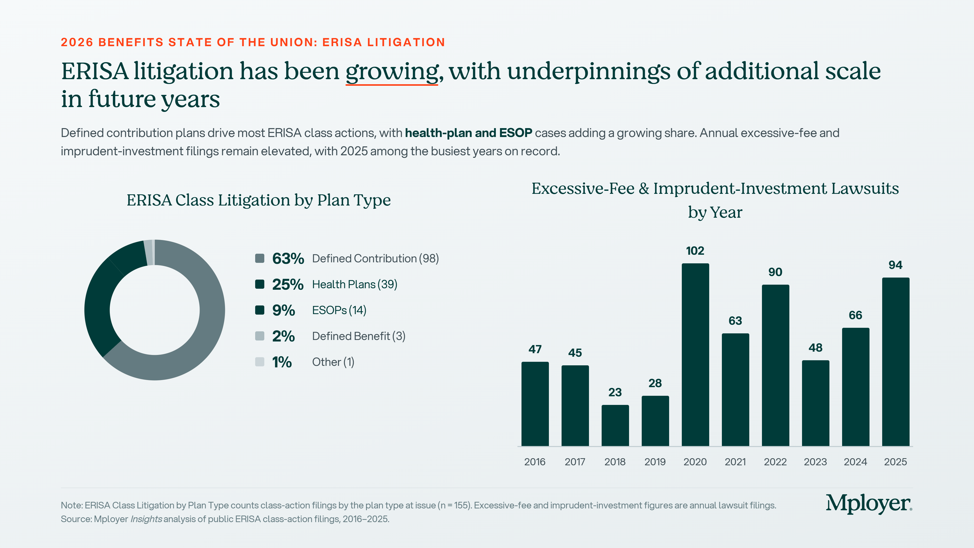
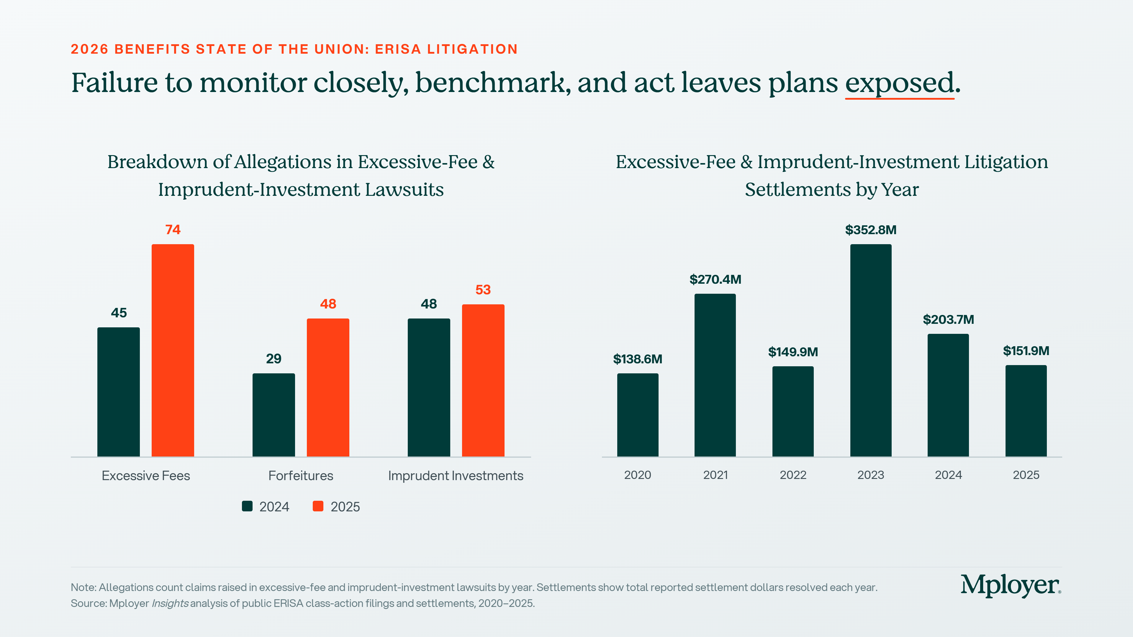


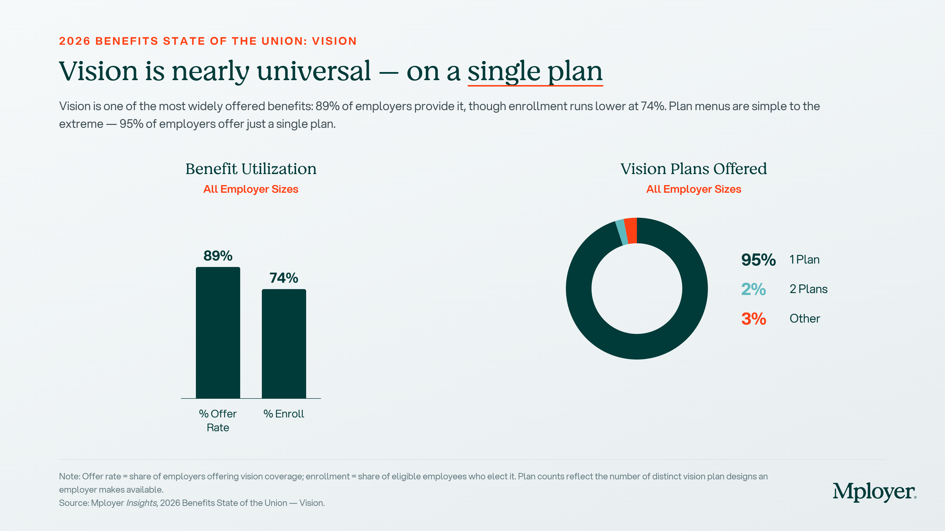
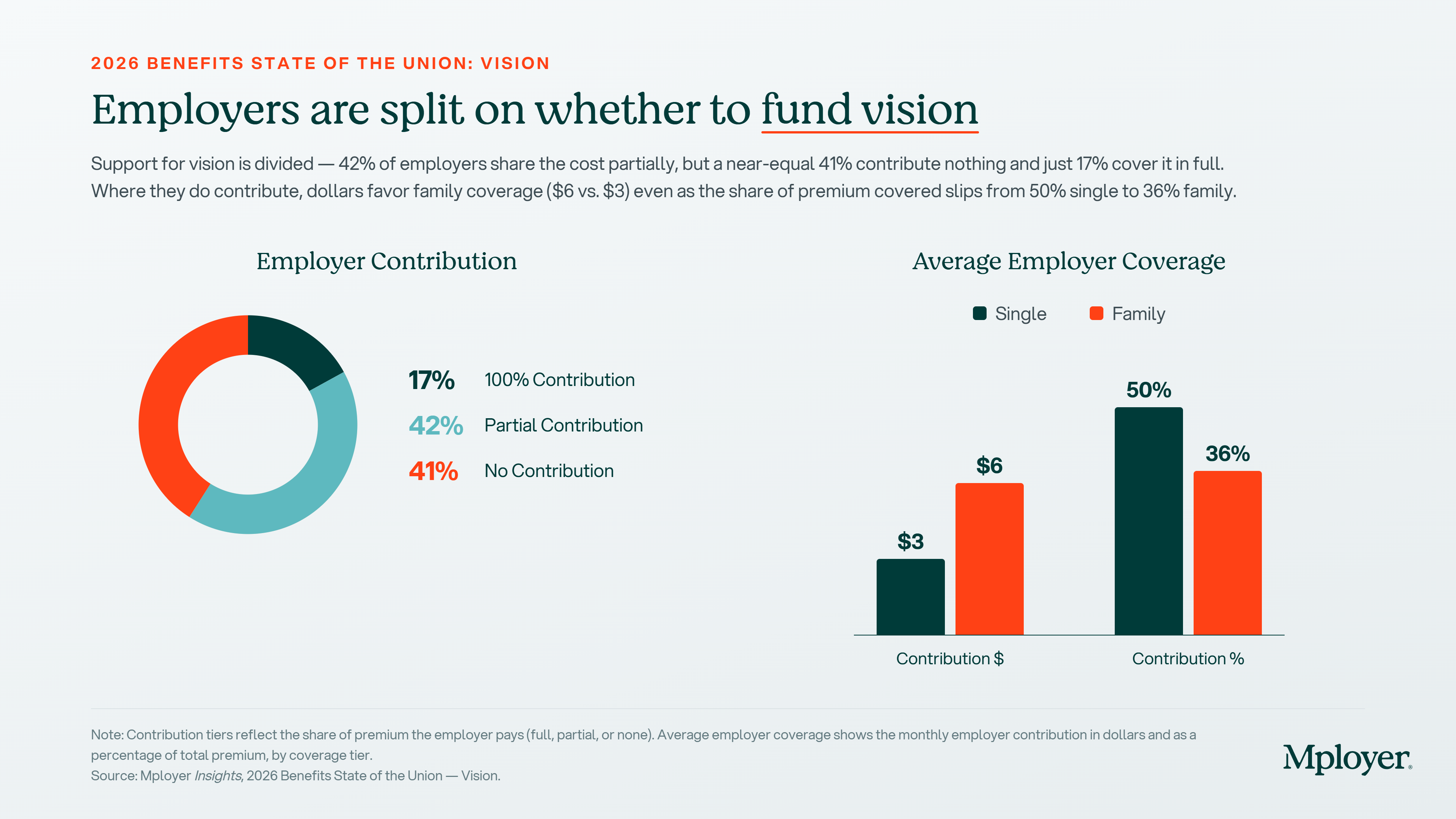


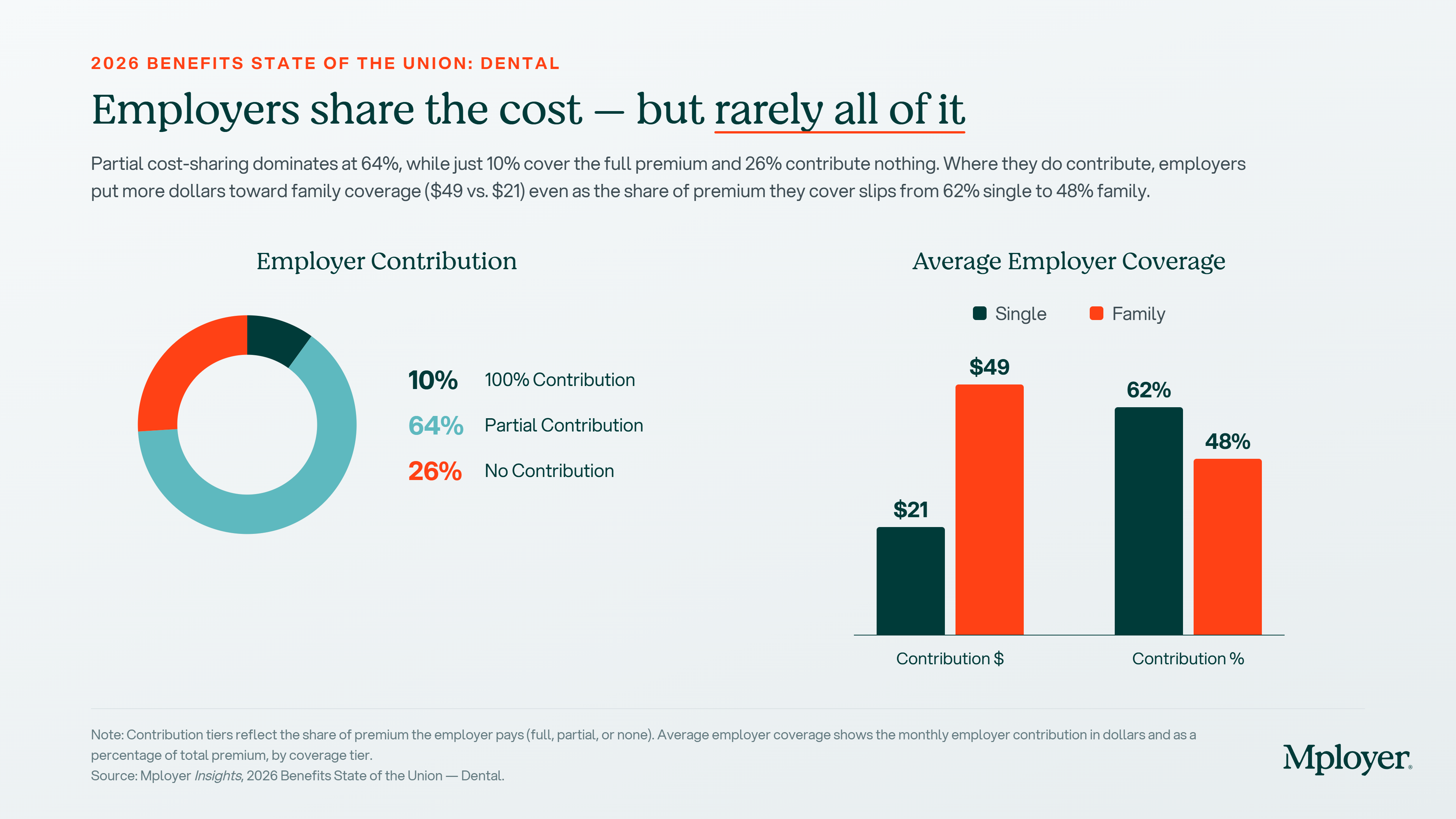

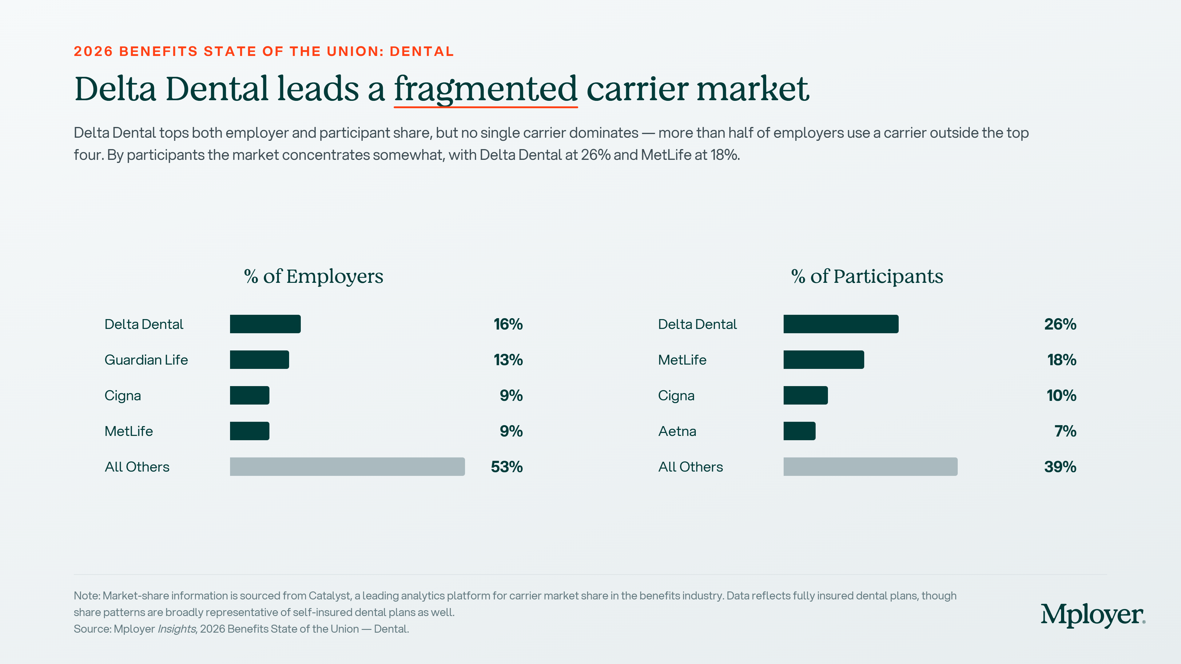

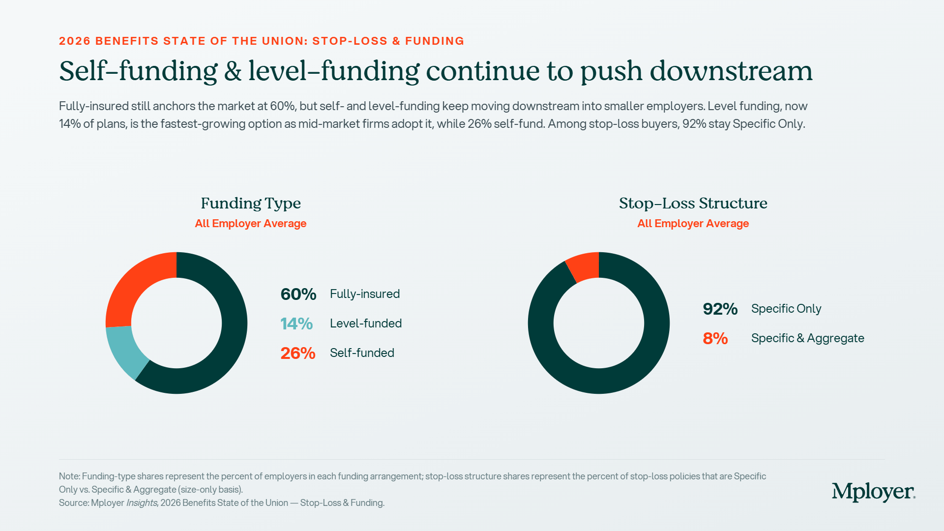
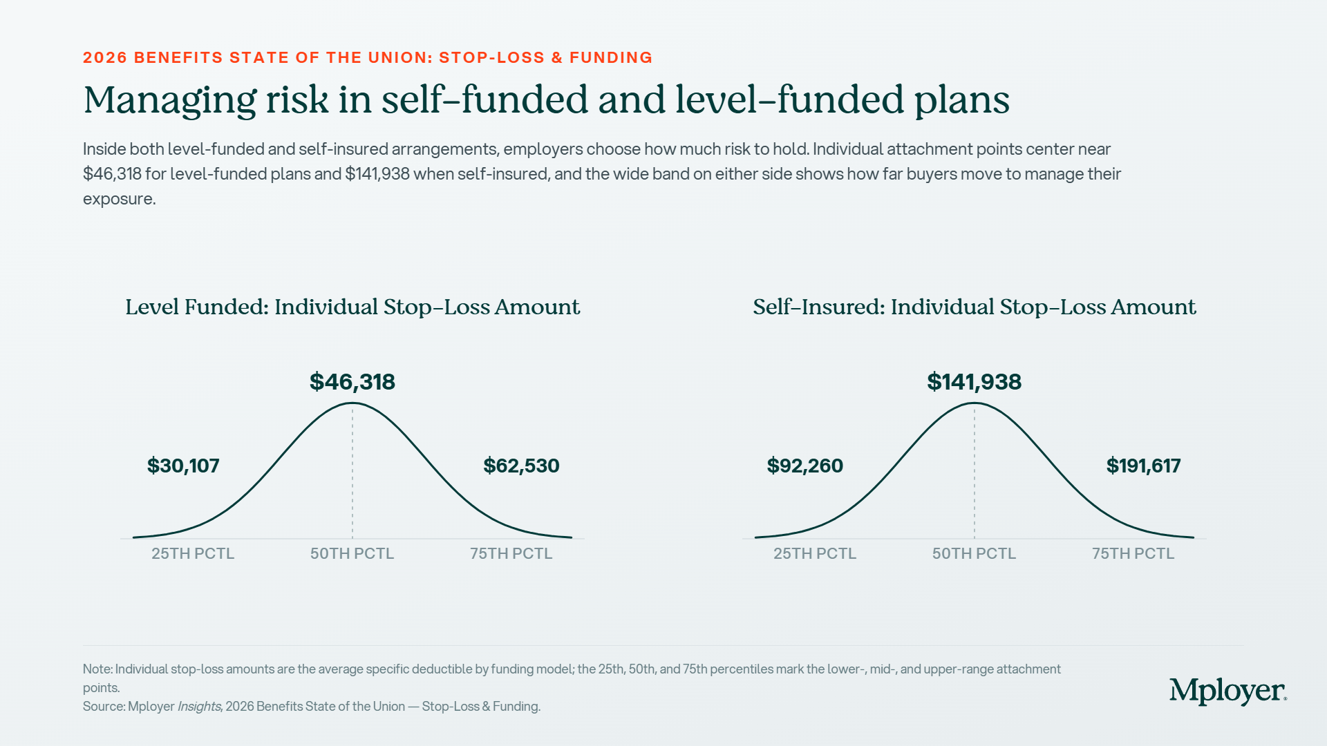
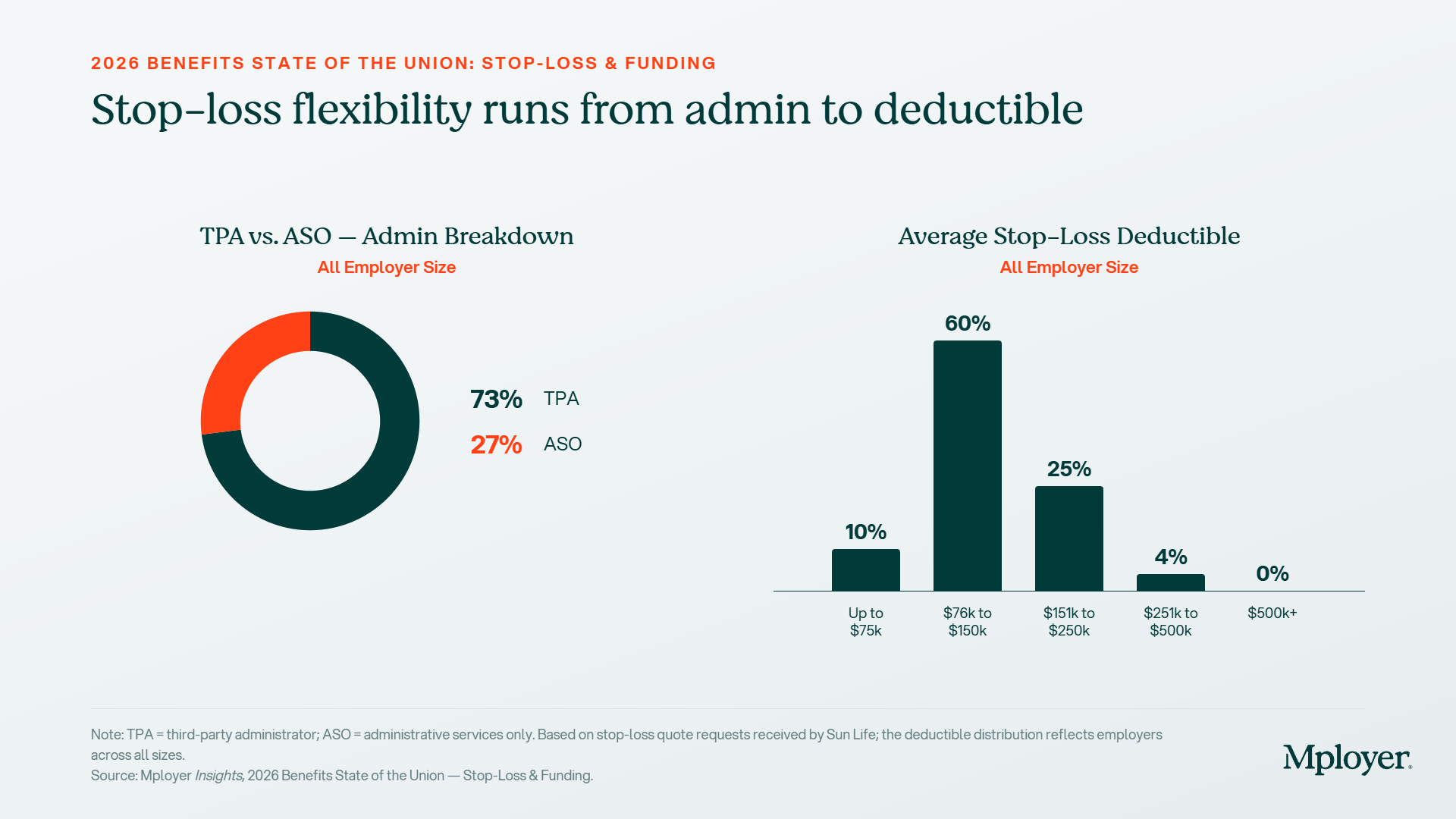
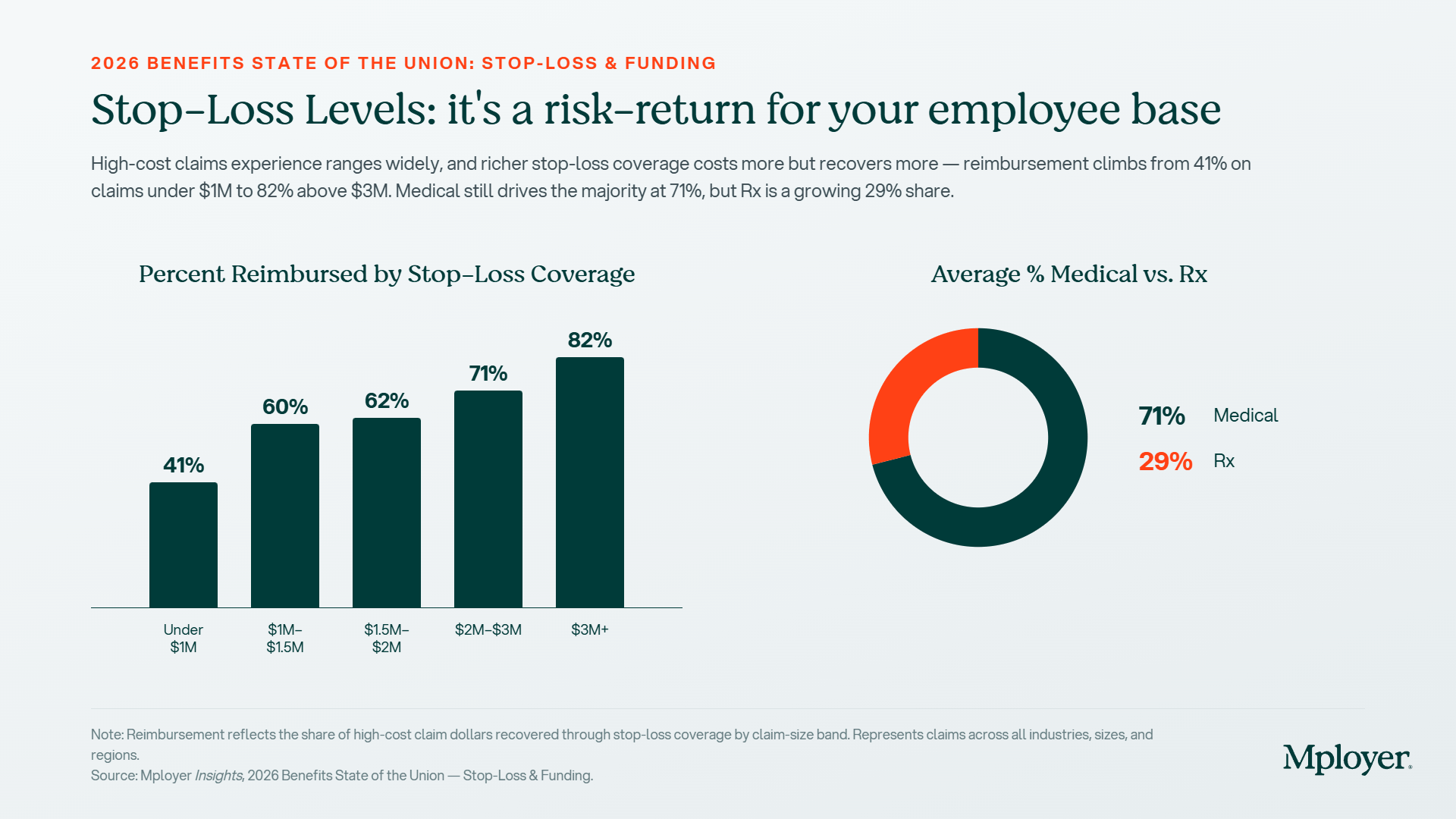
.jpg)
.jpg)
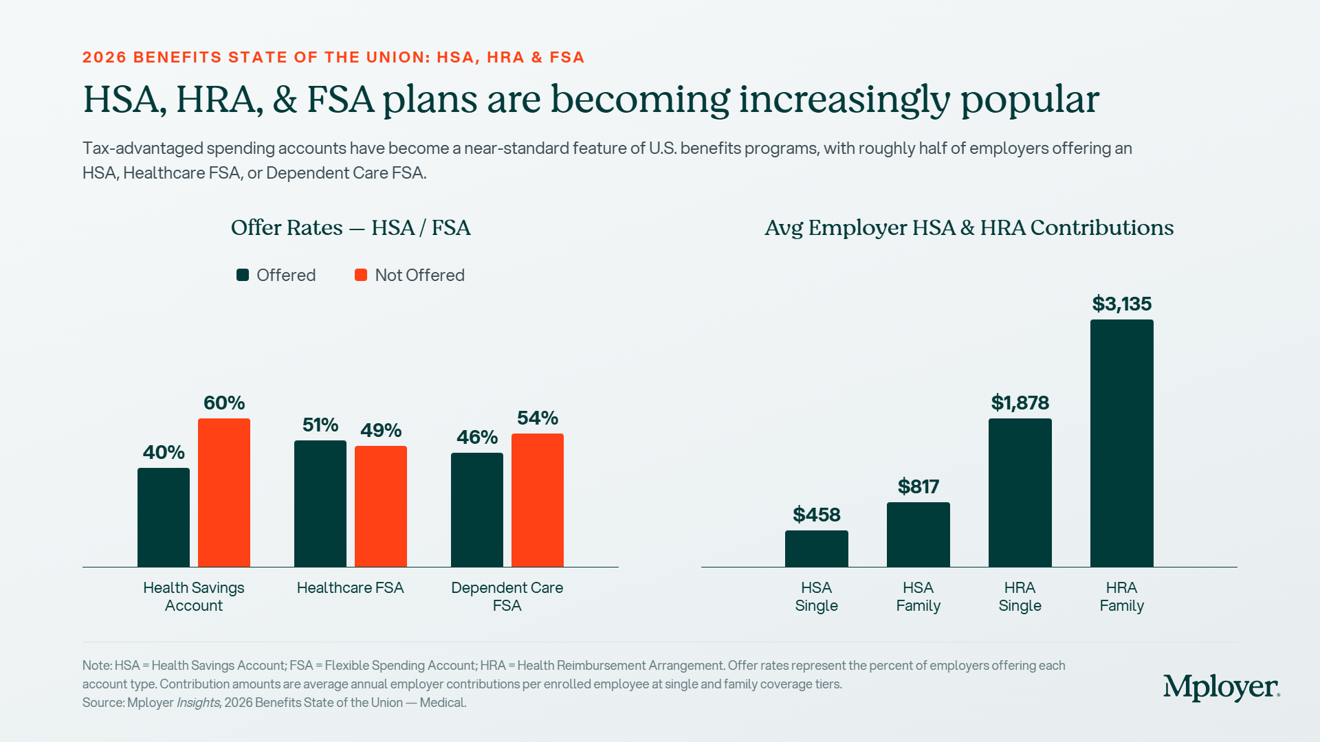


.svg)
.svg)
.svg)
.svg)